


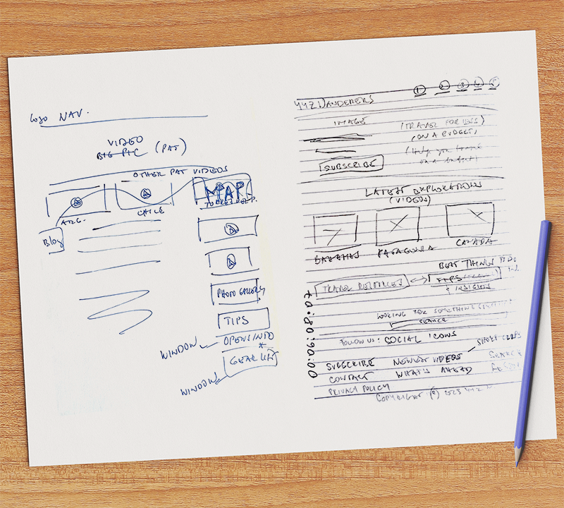
My Thought Process:
I feel that the Navigation Bar should be very simple and to the point so I included only the logo, a hamburger menu and the search button.
YYZ Wanderers-Wireframe-home page PDF
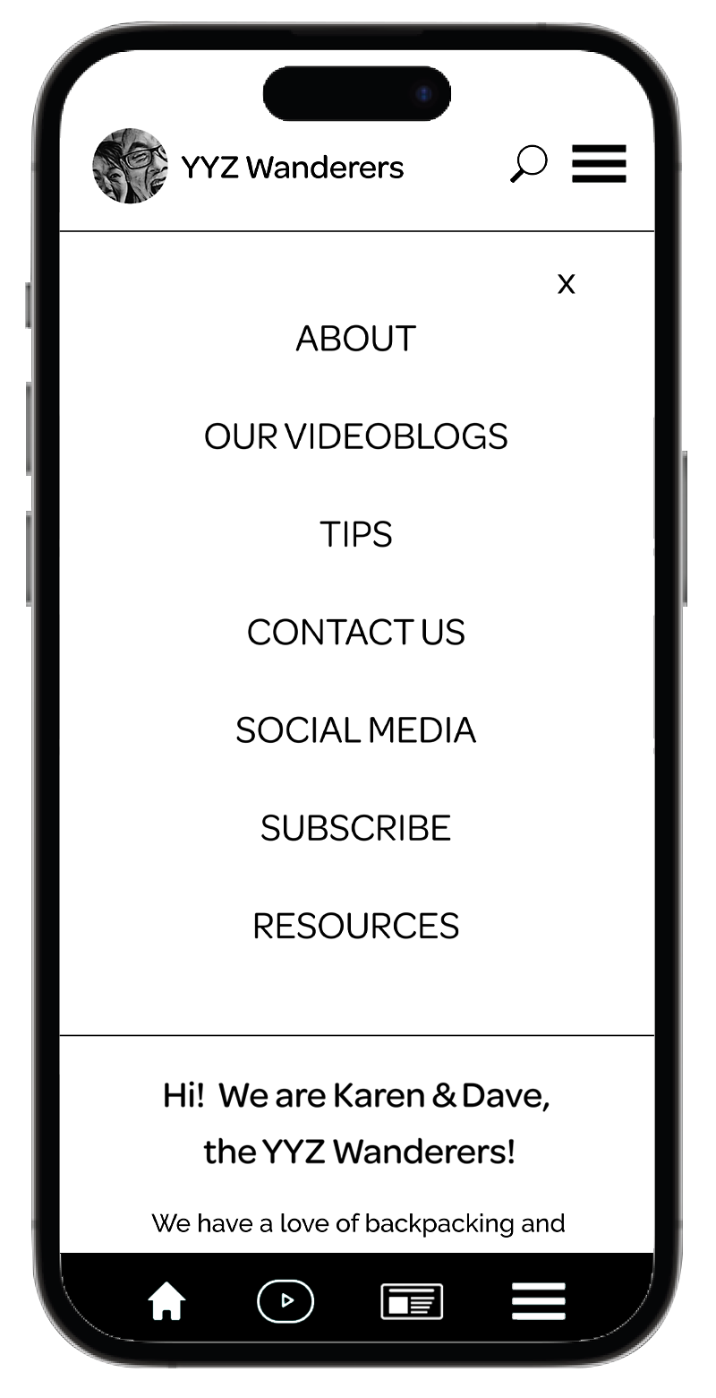
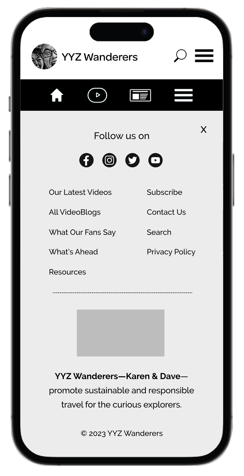
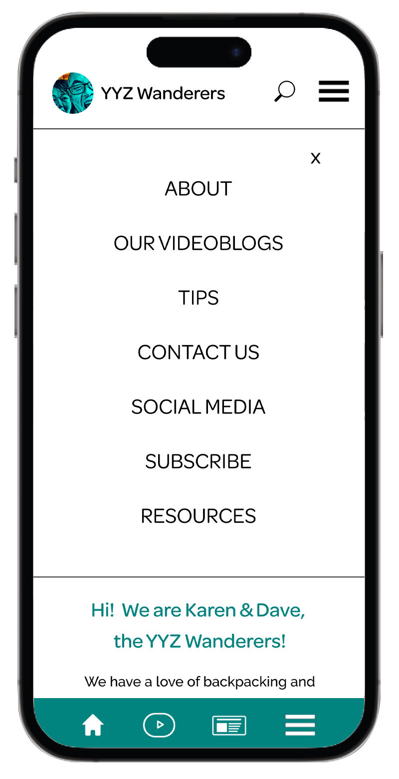
Once again I think we need to keep it simple, clear and quick so the Hamburger Menu will open to the full width of the screen and list the most important/frequently used links.
YYZ Wanderers-Wireframe-home page PDF with both Hamburger Menus open
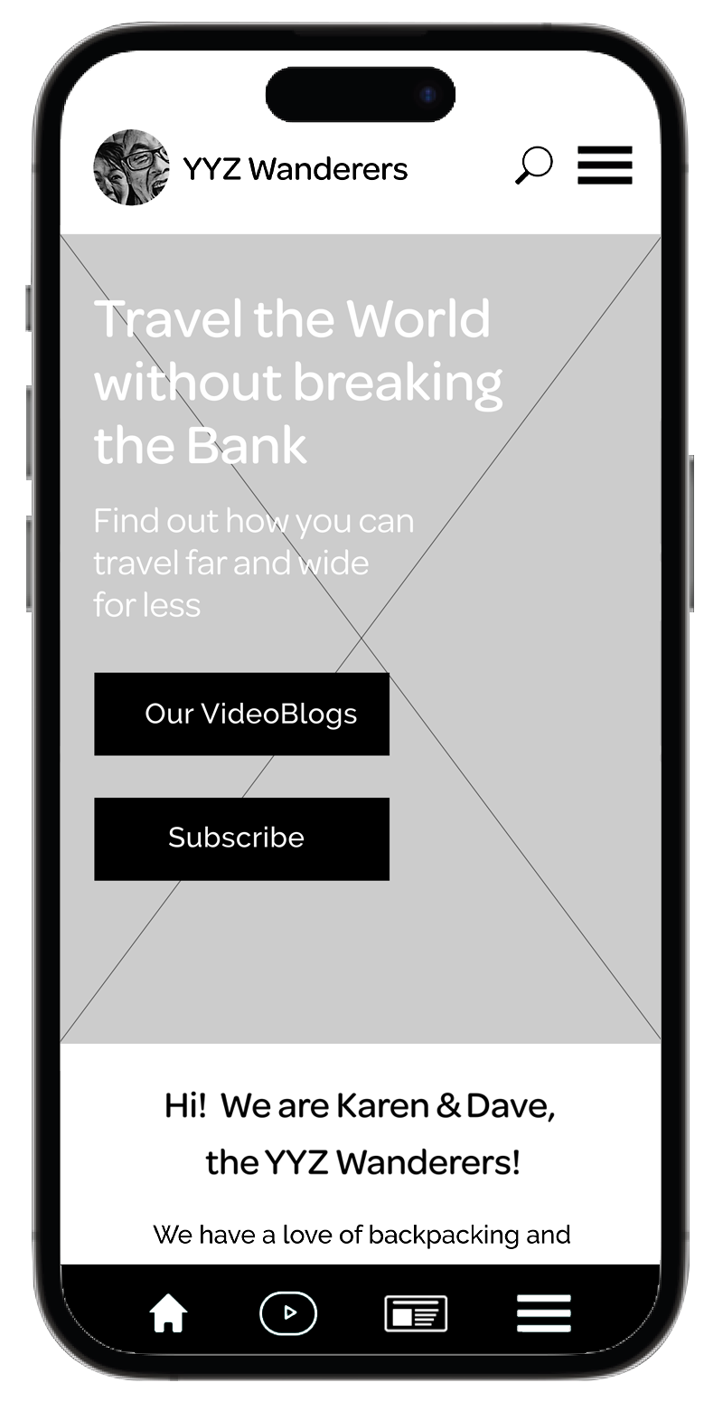
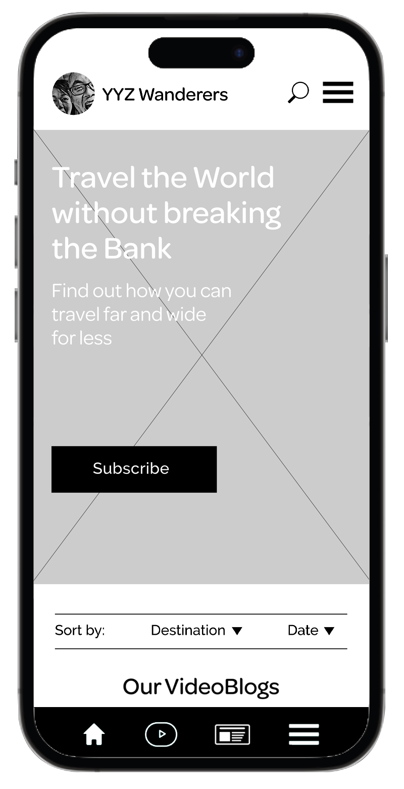
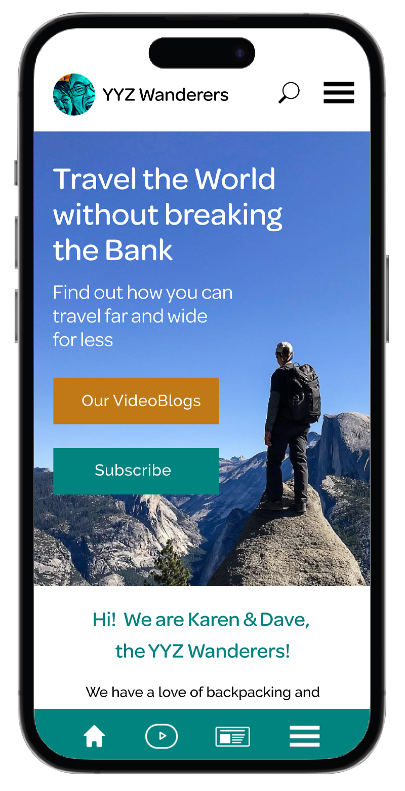
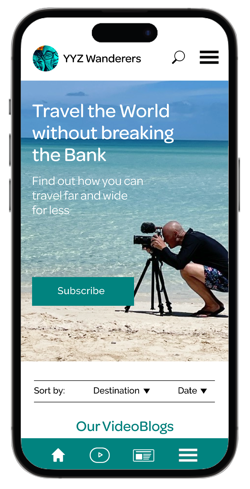
The very first image that users will see has to be striking. It should either introduce the owners (Karen & Dave) or show a person enjoying a special moment in a beautiful scenery. It will help users imagine themselves exploring the world and having a great time.
This is also the prime real estate for the Call to Action buttons: Our Videoblogs and Subscribe. Users don’t have to think and search for the blogs—they’ll see the links at first glance.
I’ll place the introduction paragraph right below the Hero image to make sure users feel welcome. I think it will make the website more personal and trustworthy.
It’s also important to mention why this Blog site is unique and better than other ones out there to make users feel that they just hit the jackpot.
In this gallery/slide show users will scroll through travel videos from the newest ones to the oldest ones with the destination and specs listed right below. They can also visit Our Videoblogs page and filter all video blogs by destination and date.
Since most travellers like to do their research before they travel, the website will offer a section with Travel Resources. Everyone likes to share a good advise from own experience, names of helpful books or websites, geographic or historic information that can’t be easily found—all of it will be just one click away.
We are counting on people loving this feature and sharing the info (including links) with their friends.
This is not a new idea but has been working well for many travel companies. Users expect a quick summary of must-see sights and interesting experiences one can participate in. So in the spirit of getting this info fast, we’ll have a dedicated section for what to see, what to do, what is unique or new in chosen destinations. Just another way to pick a place.
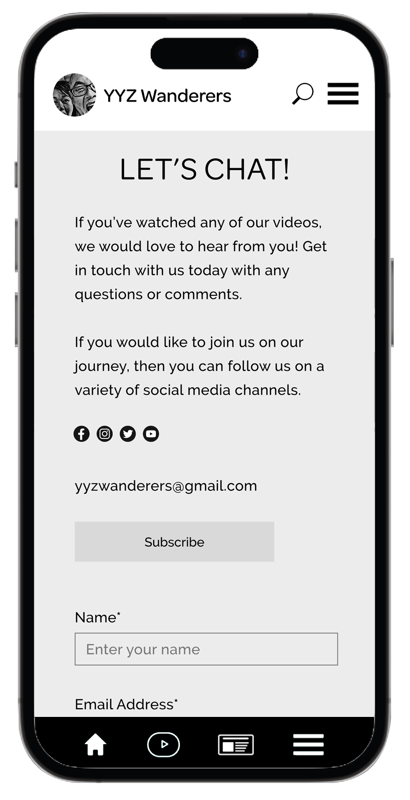
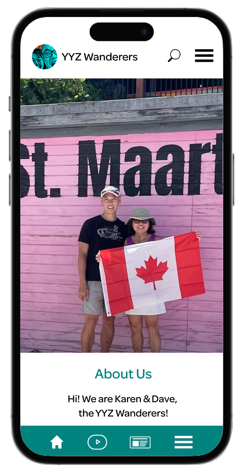
Karen & Dave are true believers in community, cooperation and sharing and they want to connect with like-minded people not just while travelling but on a daily-basis…
In this section we’ll feature a variety of their short videos suitable for relaxing, as a background music; or even as helpful footage for different projects that travellers may have.
A quick survey showed us that many users get frustrated with regular key searches because frequently they cannot find the correct words to express what they need. It’s one of those “I’ll know what I want when I see it” scenarios.
We don’t want to lose these users and so we are enhancing their search experience by adding Site Map—a hierarchical diagram of the website showing how pages are prioritized, linked, and labeled.
This will be a fun page devoted to Karen’s & Dave’s cat called Taz. It will be focused on his happy/cranky personality, his (mis)adventures, habits and will include many pictures and videos.
One doesn’t have to be a cat owner to like cats and cat videos. It’s like a drug—once you start watching, you just can’t stop…a great way to help users get to know both Karen & Dave and encourage their interaction.
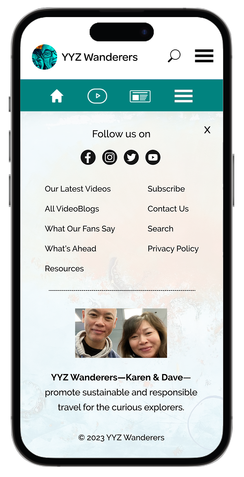
Another quick survey proved that users like to check what the Footer Hamburger Menu is hiding. They expect some special gems so we don’t want to disappoint them.
For convenience, we’ll repeat the inks from the Top Hamburger Menu, plus include “What Our Fans Say” and “What’s Ahead” to create some excitement and engagement with users (everybody is curious!)—both pages will offer something to look forward to and check frequently.
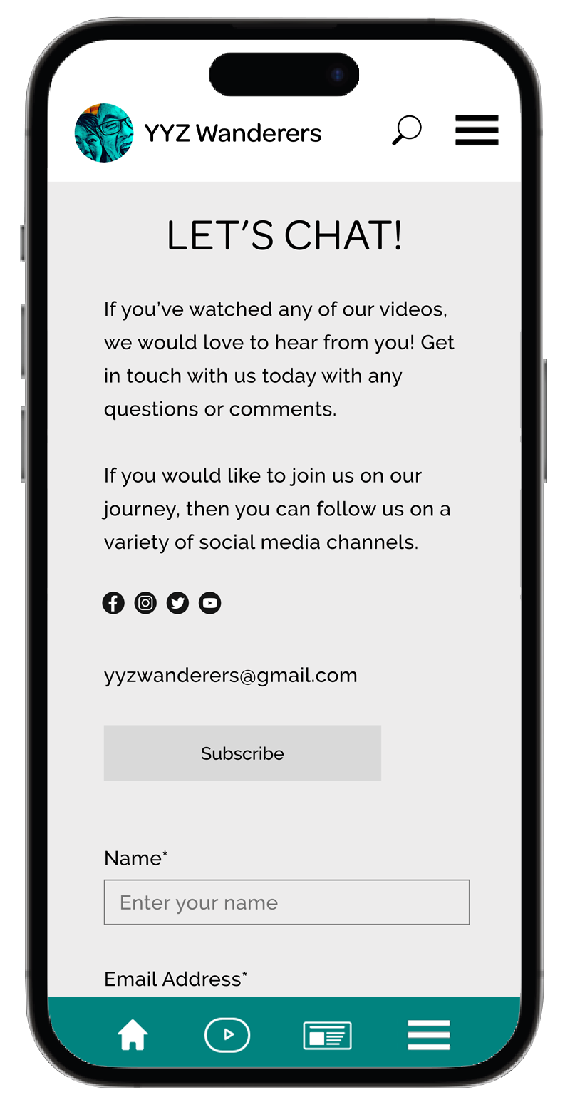
Plus, we can’t forget the Privacy Policy—we’ll be collecting names and email addresses—so we need to assure users that we’ll keep their information safe.
Both Karen & David are committed to Sustainable and Responsible Travel and this page will highlight all the steps they take on their travels to leave only the smallest footprint—this will surely make the website more trustworthy and Karen & Dave more endearing.
Low-Fidelity Wireframes
Home Page
Home Page with Hamburger Menus open
About Us page
Videoblogs page
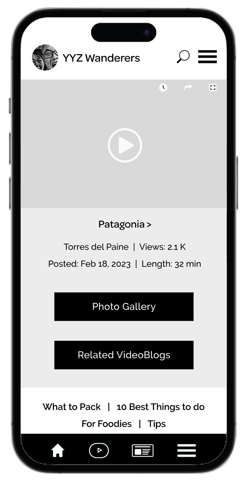
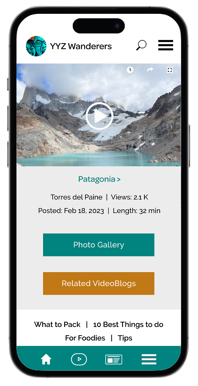
Patagonia Videoblog page sample
High-Definition Wireframes
Home Page
Home Page with Hamburger Menus open
About Us page
Videoblogs page
Patagonia Videoblog page sample
Branding & Visual Identity
Creating Brand Guidelines for YYZ Wanderers was based on an existing logo, which was easy and hard at the same time. The good part was that the logo itself was very unique and quite striking (Karen’s & Dave’s faces) so we didn’t have to worry about getting noticed and remembered by users. The bad part was that I had to work with the colours used in the logo, which felt a bit restraining. Another challenge was to find typefaces that would go well with the logo—one for headings & subheadings and one for the body copy. It took some research, testing and comparing the competition websites. But I mixed the good and the bad and created a Style Guide with a strong visual identity.
Logo Variations
Background: #01837f
Background: #000000
Logo font: Omnes Medium, #000000/#ffffff
Brand Typefaces

Omnes is a very clean and modern-looking typeface so I’d like to keep it for the headings and subheadings. Its sans-serif, yet, curvy shape also well represents the main tagline “Travel for Less”—classy but on a budget. Choosing a serif font for the headlines would probably scream “Luxury”.
Elegant and highly-legible Raleway typeface will be perfect for the body copy. It is somewhat similar to Omnes—just more upright with a modern look—and carries the clean, curvy and playful flair we’re aiming for.
Brand Colours
Teal Green #01837f
Primary
Mustard Yellow #c07916
Secondary
Black #000000
Body Copy
Teal Green Light #ccf1f0
Background 1
Mustard Yellow Light #f2e4d0
Background 2
Grey #a7a7a7
Notes, Comments
Grey Medium #cacaca
Background 3
Grey Light #edecec
Background 4
First I wanted to use the logo teal and reddish-orange colours for their strong contrast but I quickly realized that the teal colour was showing poorly on the phone and the desktop screens. I revised the shade to a greenish teal and saw a big improvement. However, the green-teal colour now didn’t work well with the reddish-orange as there was way too much contrast and almost a battle which one would get noticed first. I decided to change the second colour to a calmer mustard-like shade and the result was great—both colours complemented each other and created a nice earthy harmony.
Teal Green colour is associated with fluid communication and clarity. It is serene, calming, and, like other green blue hues, associated with nature and water. I don’t think I could find a better fitting colour than this.
Mustard colour symbolizes warmth, creativity, optimism, and diversity. A person that loves mustard colour is kind, open-minded, supportive, inspiring, acceptable and reputable…so many positive features, it seems that pairing the Mustard colour with the Teal Green will be the perfect choice.
Elements: Icons
Top Navigation & Social Media Icons
Footer Icons


Elements: Buttons


(State) Up
(State) Hover
(State) Down
Search Bar | Text Field
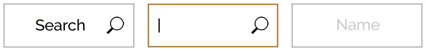
Search Button
Search Active
Text Field
Imagery
Choosing images for websites, apps or any projects is a lot of fun—especially when it comes to travel. YYZ Wanderers has an array of breathtaking photography that represents well each destination—its scenery, culture, cuisine and people. As I worked on this project, my hands were full of fabulous images from different corners of the world and the hard decision was not which images to choose but which images to eliminate. Browsing through the photographs, I kept reminding myself what the focus of YYZ Wanderers is: unique travel gems, special moments and off-the-beaten-path experiences travellers are searching for.
Motion, action, surprise, curiosity, satisfaction and [exciting whispers of] “Awww!” are some of the keywords for the mood setting, atmosphere and overall feeling that our photographs need to evoke in the users. We also want our users to be able to imagine themselves travelling and creating new experiences, so we need to concentrate on images that include people—not posing, showing a “Victory” sign with their fingers but instead, exploring new places, trying new foods, meeting local people and learning from them, or just taking in the beauty of the landscape—totally dumb-founded and speechless… They say that a picture is worth a thousand words—we believe it and are betting on it.
Conclusion
• YYZ Wanderers website was a fun project. I could relate to the owners (Karen & Dave)—what they wanted to create and achieve with this website, and also to users—what they are looking for in their searches, what their needs are and how they want to feel when navigating the website.
• Throughout the process I reminded myself how important it is to simplify the design to allow a proper and quick functionality and easy navigation. Clarity was also at the top of my concerns—how good is a quick and pretty website if I can’t figure it out…?
• Working on wireframes was challenging as every time I tried to address one issue, ten more would arise. But that was also a valuable thing for me since it allowed me to deal with these issues in the beginning stage when nothing was set in stone and revisions were just one arrow or one button away.
• What helped me in this project was my experience in travel business. I’ve been working on travel brochures, flyers, emails and websites for a number of years so every time I hit a road block, I returned to my experiences from the past—pondered what worked and didn’t work, compared it with similar problems or recalled what other suggestions had been offered to help me search for the best solution.
I truly enjoyed the whole process and felt a tremendous amount of satisfaction from every achievement along the way. I believe that my next project will bring even more joy and fulfillment.
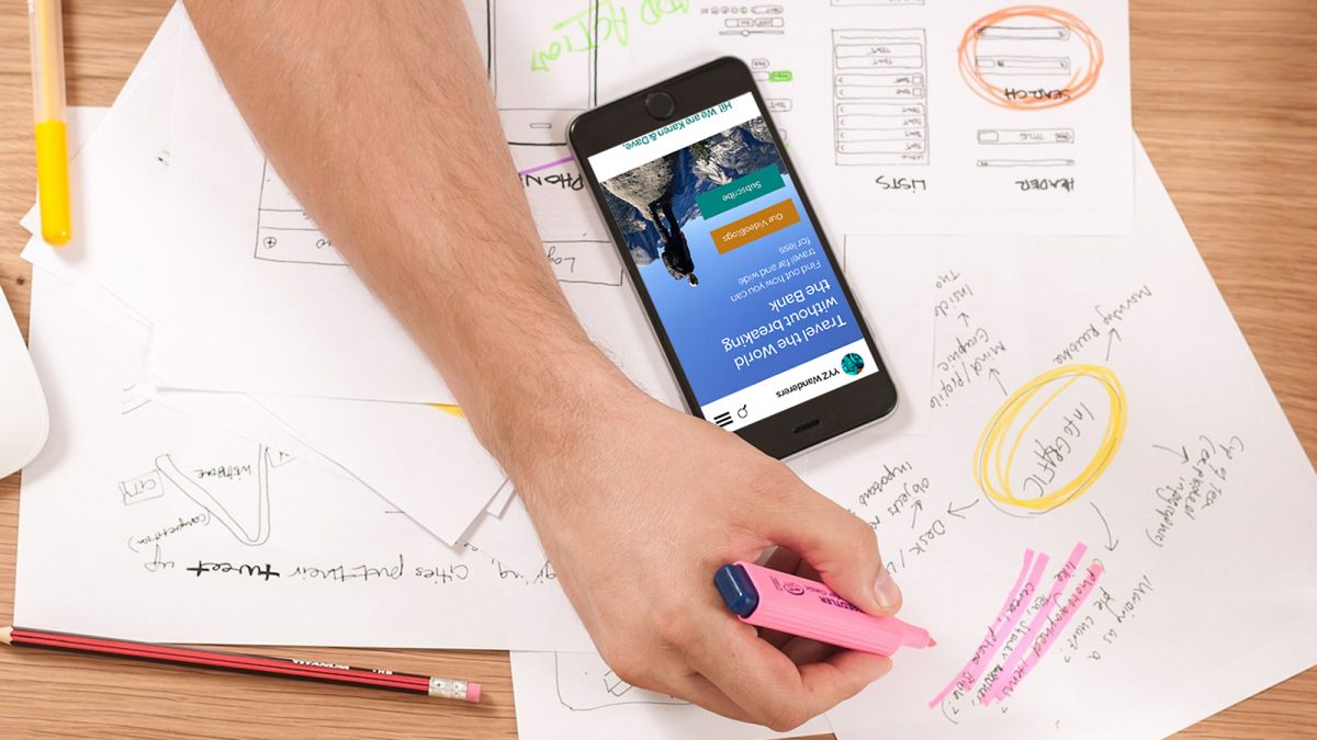
‹ Click on the mobile phone to navigate to other pages or scroll down to see more.