Mike Kuniavsky, Technology R&D Senior Principal at Accenture Labs
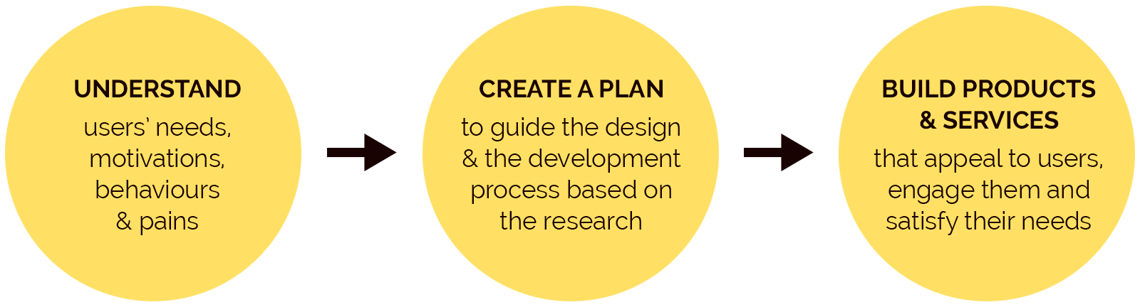
4 Research Phases
If we had an infinitive amount of money and time, we could spend months and years working on projects till one day they would get done—just to find out that there are many mistakes, missing steps, or that we just built a completely wrong product.
To avoid that scenario and keep more money in the bank and more time for other fun ideas, we do the research first, create a strategy or a plan, and then delve into the design.
To avoid that scenario and keep more money in the bank and more time for other fun ideas, we do the research first, create a strategy or a plan, and then delve into the design.


1.) Ways to Discover
• Ethnographies
• Context Chats
• Trend Research (Assignment example)
• Secondary Research
• Assumption Mapping
• Stakeholder Interviews (Assignment example)
• Speculative Design
• Ethnographies
• Context Chats
• Trend Research (Assignment example)
• Secondary Research
• Assumption Mapping
• Stakeholder Interviews (Assignment example)
• Speculative Design
An online store for mountain biking enthusiasts—from beginners to professionals—offering high-quality bikes, components, gear, accessories and clothing
It’s a definite YES to gamification from me.
My first thought was that everybody would like to join or play a game that involves their hobby, favourite store or an app they use on a daily basis. Why not, if it gives you a chance to collect points towards other purchases or win a cool swag?
Well, before I made the “Yes” decision, I actually did my research to make sure I’m not fighting just for my personal opinion. Who knows, I may have to change my opinion…?
The Pathetic Don Valley MTB Group is a
Facebook group with
418 members (yes, it’s
real).
1.
First, I contacted my friends/mountain bikers in Toronto—members of an online group “The Pathetic Don Valley MTB
Group”—and did a survey with its members. I gave them just
one question: Would you engage in games posted on your
favourite mountain biking store website/app?, and four possible
answers to choose from.
149 members responded to my survey as per below:
149 members responded to my survey as per below:

As the survey revealed, it’s a big Yes with a magic word “if”.
It’s a very positive result and the “if” was very much expected.
All stores are prepared to reward the participants with special
points, credits or swag items. We are on the right track.
2.
Next, I checked a well-respected e-learning industry
website to learn about pros & cons of gamification from the
professional point of view. Here’s what I found out:

I pondered on the pros and cons and applied their logic in the
mountain biking store scenario and came to a conclusion that
the costs and time shouldn’t be a huge issue.
The store sells a high-quality and high-price equipment/products that attract well-off amateur and professional athletes. They are prepared to pay for the quality plus something extra and so the store must be ready to offer them that something extra to keep them coming back.
The store sells a high-quality and high-price equipment/products that attract well-off amateur and professional athletes. They are prepared to pay for the quality plus something extra and so the store must be ready to offer them that something extra to keep them coming back.
3.
My third choice was to explore this subject from a more
business research point of view and I found some very
interesting stats: between 2016 and 2019 the number of
worldwide app downloads grew from 140.7 billion to 204
billion (as per Statista, 2020). However, only 32% of users
employ any one app more than 10 times. Similarly, 25% of
mobile apps are used only once after being downloaded (as
per Localytics, 2019). That means that one of the most
important challenges for companies is to figure out how to
keep users continuously engaged and thus loyal to their
brands. Gamification seems like a perfect idea to delve into.
As per Huotari & Hamari (2017, p. 25), gamification is defined
as “a process of enhancing a service with affordances for
gameful experiences in order to support users’ overall value
creation.” We can see an increasing number of mobile app
developers incorporating gamification into their apps trying
to enhance the user experience and user engagement. One
could almost say that gamification is becoming a standard
addition that is expected—it helps make money!
The findings demonstrated that user engagement with the
gamified app promotes continued use intention, however, the
article also admits that few studies have investigated the
influence of gamification on user engagement and therefore
more research needs to be done.
3.) My Conclusion:
After I analyzed my research with the mountain bikers group, plus the Pros and Cons (the results of e-Learning Industry’s research have been shared by many other research groups and agencies) and the stats & research posted by ScienceDirect, I came to this conclusion:
After I analyzed my research with the mountain bikers group, plus the Pros and Cons (the results of e-Learning Industry’s research have been shared by many other research groups and agencies) and the stats & research posted by ScienceDirect, I came to this conclusion:
In today’s digital age, it is not enough for companies to offer
first-class products/services, create apps for users and spend
a ton of money on promoting them via social media. We are
all bombarded by new apps, social media ads and social
influencers and are most likely to download way too many
apps that we try ones and never touch again.
Companies have to do more—they have to “attack” our inner
child (a playful child) and use psychology, especially
behavioral studies, to keep us interested and engaged.
People tend to search for challenges and competitions with
social-oriented elements that give them a feeling of
achievement (fast satisfaction) and help boost their selfworth.
It’s not only about products anymore, it’s also about
Experience, Social Connection and Relatedness.
Next step? Find a way to use gamification to make us all
smarter, more empathetic and more respectful.
Stakeholder Interview & Audience Segments for Mountain Bike Store
An interview with John Nickle—an employee of Mountain Bike Store
An interview with John Nickle—an employee of Mountain Bike Store
1. Question:
Tell me about your love for mountain biking.
Tell me about your love for mountain biking.
1. Answer:
• Keeps me active, in shape
• Helps me to destress after work
• Helps me to socialize with other like-minded people
• Gives me an adrenaline rush—the good kind
• It’s something to look forward to, it makes me happy
• I’m pretty sure that most if not all mountain bikers feel the same way
• Keeps me active, in shape
• Helps me to destress after work
• Helps me to socialize with other like-minded people
• Gives me an adrenaline rush—the good kind
• It’s something to look forward to, it makes me happy
• I’m pretty sure that most if not all mountain bikers feel the same way
2. Question:
Since you meet your customers every day, can you describe them to me?
Since you meet your customers every day, can you describe them to me?
2. Answer:
• Some are really nerdy—like my friend who builds bikes—they like to talk about biking and share what they’ve learned, they are always happy to help and get their hands dirty
• Some are real adrenaline junkies, they just love the speed and racing other bikers. With them, everything is a competition but they have a huge respect for other fellow bikers, especially the crazy ones
• We get the weekend riders too, they don’t care much about all the fancy gadgets, they just love spending time outside
3. Question:
What are their biggest complaints?
What are their biggest complaints?
3. Answer:
• Biking trails—they are not well-kept, sometimes overgrown by grass and sharp tree branches which makes them dangerous (especially at night). Some other bikers keep cleaning and fixing them but many just ignore the problems.
• More biking trails to choose from—some like riding the same trails over and over again or till they perfect them, but others like a variety to choose from.
• Fellow bikers—they need to be more considerate, aware of other bikers on the trails; that’s why there’s a biker’s etiquette with do’s & don’t’s.
4. Question:
How valuable is the MB store to the biking enthusiasts and the local community?
How valuable is the MB store to the biking enthusiasts and the local community?
4. Answer:
• I bought my first bike in that store! Well, I bought all the parts and my fellow biking friend put it all together and built me a bike. He likes to do the research what’s new and how to improve bikes…I just like to ride them!
• As an employee I get a discount so I buy all my biking gear and clothing there but I know that some bikers buy their stuff on Amazon because it’s cheaper.
• It’s not just a store but a service place too. You can get your bike fixed, tuned-in; we do workshops for safe riding, how to take care of the bike and some techie stuff; it’s like a mini community centre.
5. Question:
What kind of feedback have you received on your online store?
What kind of feedback have you received on your online store?
5. Answer:
• People like that it’s clean and easy to navigate
• Some guys, especially the beginner bikers, don’t like the “high-end” terminology, they have to google some words
• The bike group links are great, especially for those new to Toronto
• More serious bikers would like to see more info on various Canadian and international bike races on our website
3 Audience Segments based on my interview
1: Techie-Nerdy Bikers
2: Adrenaline-Rush Seekers
3: Casual Enthusiasts


•
Technical riders who like not only biking but also discussing biking, riding techniques, trails, professional racers, etc.
• Love reading about new technology/new gadgets and testing them on their own
• Enjoy riding every day, like the challenge of technically-difficult trails and like to ride them until they’ve fully “mastered” them
• Like to share their knowledge and help other fellow bikers
• Care deeply about the quality of the trails and enjoy fixing them, while making sure not to destroy the environment
Needs: new gear and gadgets, new trails, attending/watching bike races and DIY or “How to” videos
•
Adrenaline junkies (not in the bad way) who devote their lives to the thrill of speed and danger
• Highly-competitive, love to participate in challenging bike races
• Don’t like to share their biking tricks but appreciate perfection and creativity of other bikers
• Love reading about new technology/new gadgets that help them achieve higher speed or learn new tricks
Needs: always the newest biking technology, best bikes, good-quality bike service, being up-to-date with all mountain bike races
•
Recreational bikers enjoying exercise and being outdoors when the weather is nice (spring-fall)
• Own medium-quality bikes but no extra special gadgets
• Don’t like to spend too much money
• Ride with bike groups for the social aspect of it
• Don’t care much about the riding technique or improvement
Needs: fixing/servicing their bikes
• Own medium-quality bikes but no extra special gadgets
• Don’t like to spend too much money
• Ride with bike groups for the social aspect of it
• Don’t care much about the riding technique or improvement
Needs: fixing/servicing their bikes
2.) Ways to Explore
• More Interviews
• Personas
• Journey Mapping (Assignment example)
• Card Sorting
• Heuristics
• UX Audit (Assignment example)
• Comparative Analysis
• More Interviews
• Personas
• Journey Mapping (Assignment example)
• Card Sorting
• Heuristics
• UX Audit (Assignment example)
• Comparative Analysis
The areas of focus for this website should be the Home page—the first impression, its message, clarity, focus and navigation—to make sure the users know what the website is selling, that the page is attractive, with intuitive navigation, and that it grabs users’ attention enough to get them explore other pages too…(and eventually make a purchase); the Product pages—consistency, simple layout, functionality—to make sure we don’t have any dropoffs; and over all Wayfinding, Search ability, Help and User Experience—to keep users engaged and happy.
• Home page at first glance: not aware of all merchandise the company sells—focus is mainly on clothing
• Home page aesthetics: colourful, bright, flashy, busy—inviting to some users but overwhelming to most
• Product pages: clear and consistent throughout
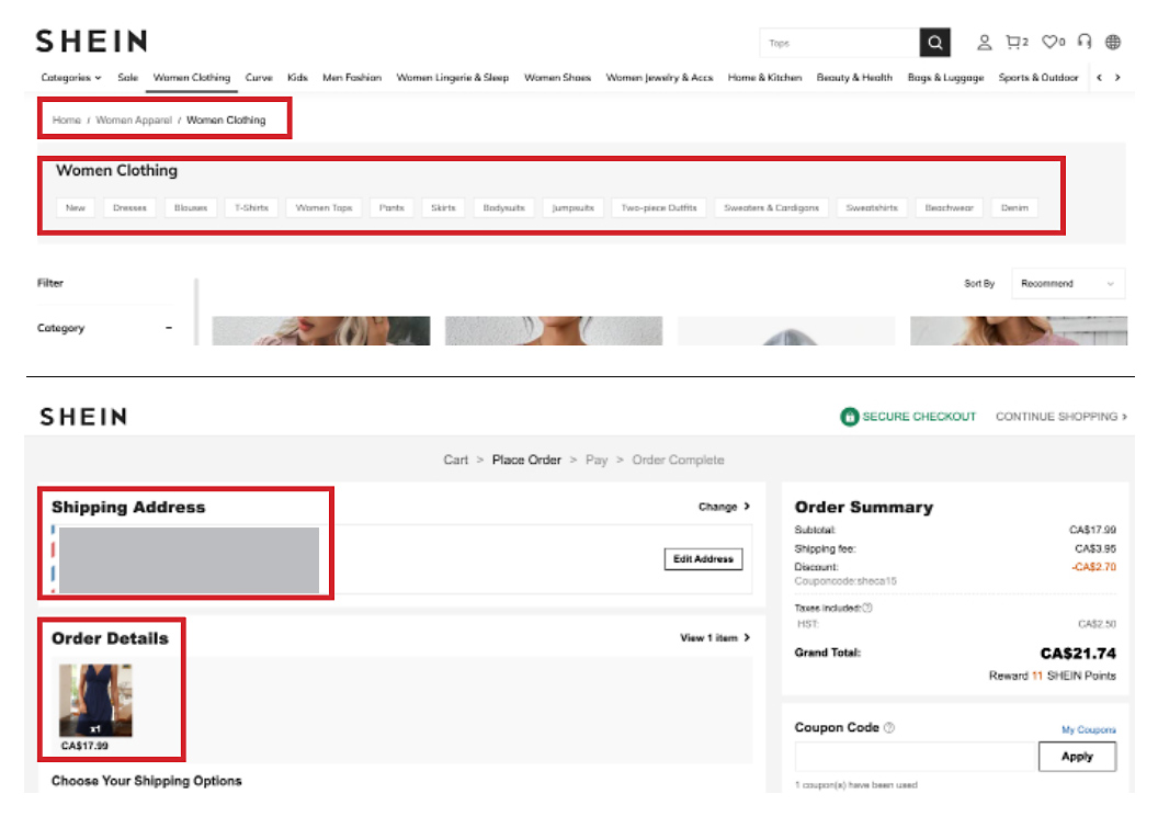
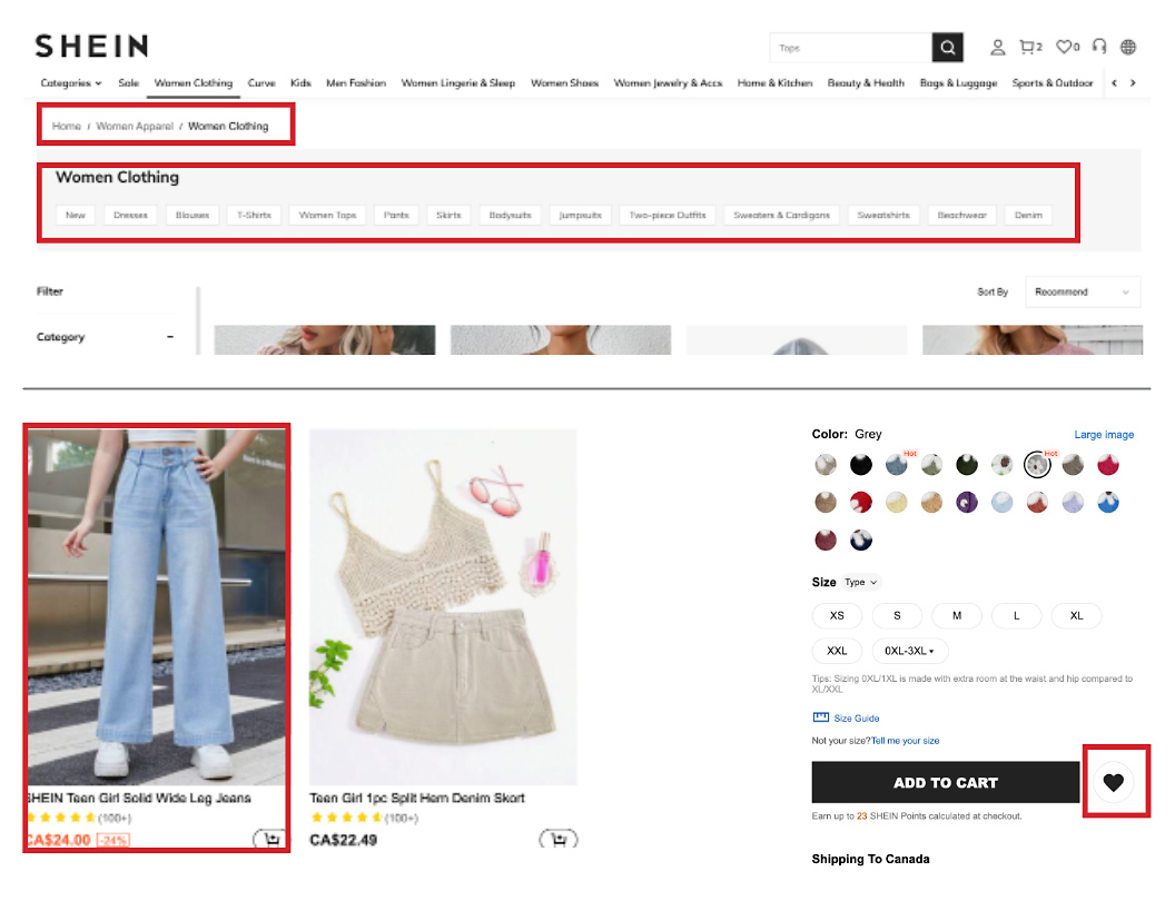
• Wayfinding: easy and intuitive navigation with breadcrumbs
• Error prevention: good—option to cancel, remove the product, go back
• Home page aesthetics: colourful, bright, flashy, busy—inviting to some users but overwhelming to most
• Product pages: clear and consistent throughout
• Wayfinding: easy and intuitive navigation with breadcrumbs
• Error prevention: good—option to cancel, remove the product, go back
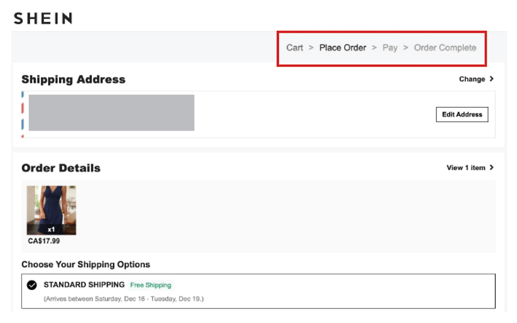
1) Visibility of system status: A
Breadcrumbs on each page are a perfect indicator where the users are and where they came from. On the Checkout page users can see the progress of the purchase with highlighted sections, one at a time—Cart, Place Order, Pay, Order Complete—as they complete each step. While the purchase is being processed, users get a notification on screen asking them not to refresh or close the page as it may take a moment.
Recommendation: the indicators on the Checkout page could be larger and in colour to make them more prominent—and to make it clear that the purchase completion is only four quick steps away.
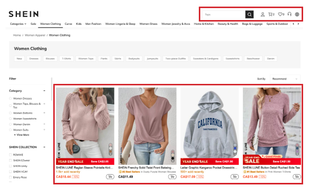
2) Match between system and the real world: A
Shein uses a very simple language, names and labels that are widely understood; icons that are familiar to users from other similar e-commerce websites. The interface is clear and follows the real-world conventions and logical order. Overall, users get a very intuitive experience.
Recommendation: shorten the names of the products—currently they are very descriptive which makes them long and users can’t see it all. It might be better to use another/additional line for the description.
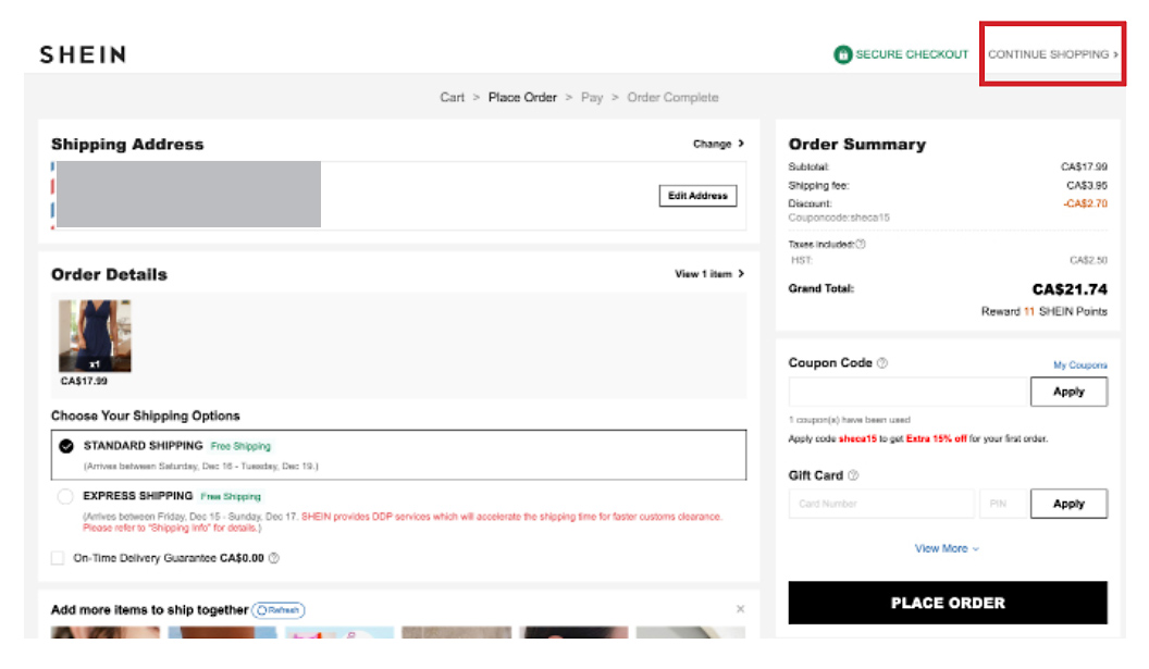
3) User control and freedom: B
The browsers themselves offer some degree of control by having forward & back arrows. Shein offers extra control on the Shopping bag and Checkout pages. When users add items to their carts, they can move them to their favourites or remove them completely. On the Checkout page, users can’t remove items, or adjust quantities but are able to leave the page and continue shopping—i.e., cancel the transaction altogether. Free Exchange and Returns also add extra freedom and control—users feel more confident about making purchases.
Recommendation: add a Cancel button on the Checkout page. It does have a Continue Shopping link but some users might get confused and wonder what will happen to their purchase and all the info they had filled out. Let’s give them peace of mind by assuring them that the purchase was cancelled.
4) Consistency and standards: A-
Shein’s language, labelling and the choice of colours and icons is clear, consistent and follows industry conventions. External patterns, such as position of buttons and icons, are also consistent and follow industry standards.
Recommendation: red colour is used to announce Sales—as the background colour. Yet, the discounted prices are in orange. I would keep the red colour (more legible) for both, not just the box but also the price, just to keep it fully consistent.
5) Error prevention: B
With Shein, first-time shoppers qualify for a special discount on their first purchase. However, by the time users land on the Checkout page, they may forget all about it so Shein applies the discount automatically and highlights it in red. If there are other promos available, there is a handy promo tab on the page that allows them to check—however, these are not applied automatically. Users can also review the list of their items before clicking on the Place Order button—just to make sure. Another feature that may also fall into this category is Favourites. If users are not sure they want to purchase an item, they can “store” it in the Favourites. Shein will notify them about the price reduction or when the quantities get low. This feature gives users more time to think about their purchase and not purchase it impulsively—in error.
Recommendation: I think all discounts should be applied automatically, not just the first-time buyer one. Currently, there is still space for error and unhappy users.
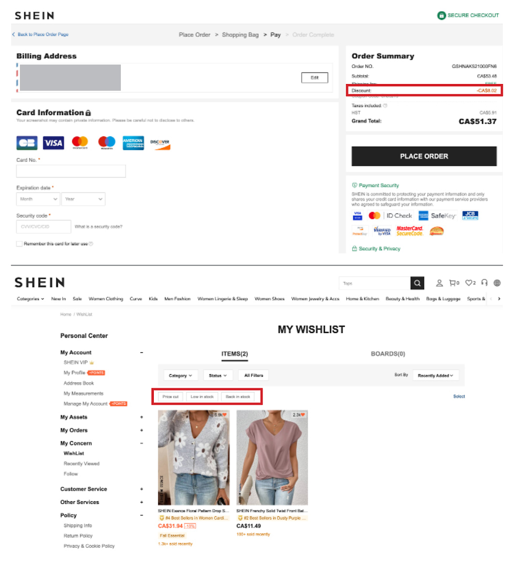
6) Recognition rather than recall: A
Shein’s website uses submenus that help users identify what other subcategories are available under the main category they had chosen. Breadcrumbs are another helpful tool to remember where our journey started without much searching. From the moment of “add to shopping cart” to checkout we can see all the items we chose to purchase—there is no need to write this info down or try to remember. Personal information—address and credit card—can be saved for future purchases, if users choose so.
Recommendation: can’t think of anything.
7) Flexibility and efficiency of use: A-
Those who visit Shein’s website frequently usually know what they’re looking for and don’t want to click on menus and submenus—they can just use the Search button and type in a key word for the merchandise they are looking for. It’s a great time-saving tool. Users can also click on the Promos tab, scroll to the very bottom, and click on “Apply All” button to collect all promotions. Way more efficient than selecting one promo at a time.
Recommendation: include the Favourites icon for each item on the product landing page—currently, users have to visit the specific product page to add it to the Favourites.
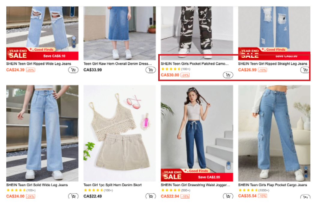
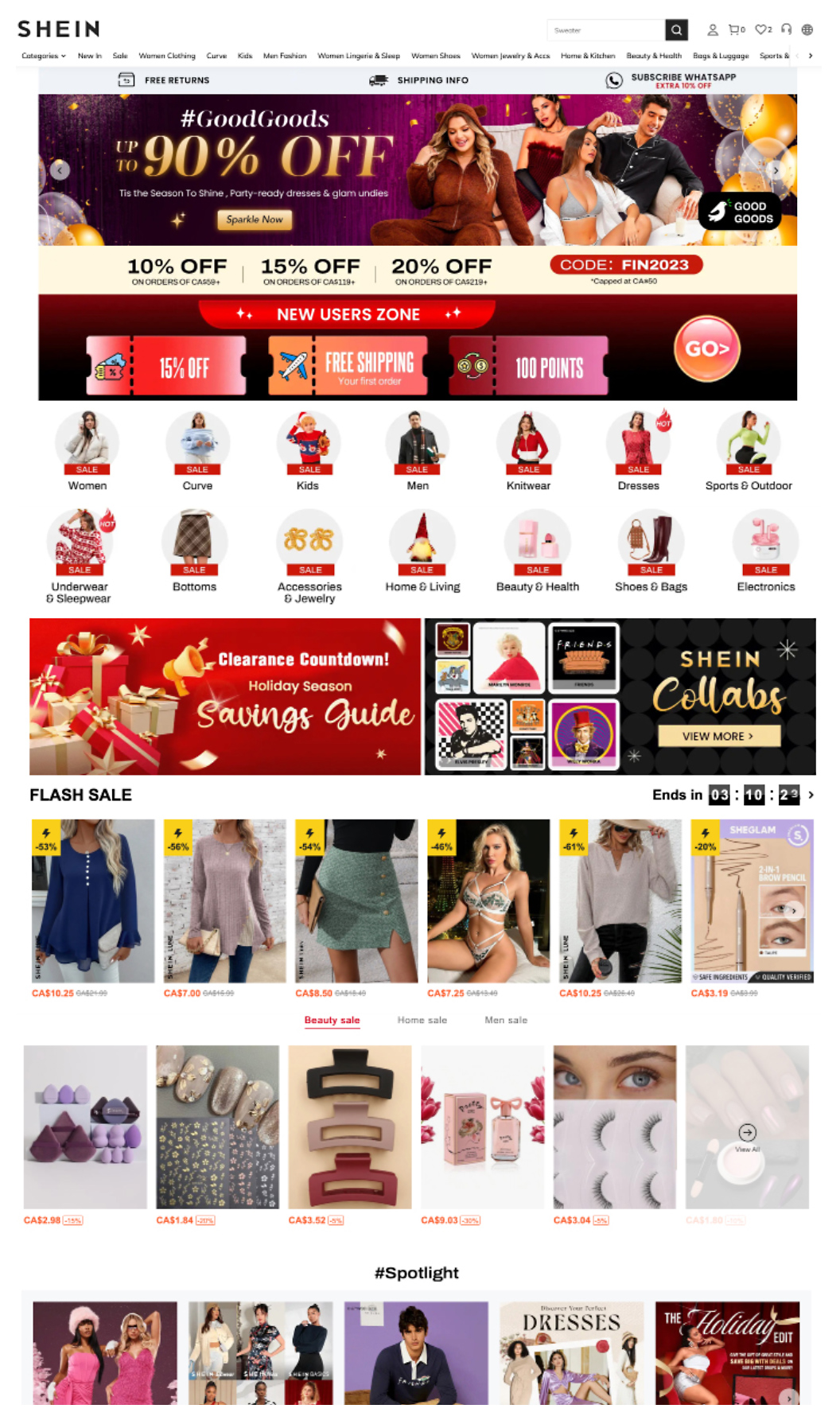
8) Aesthetic and minimalist design: C
Shein’s website comes across as colourful, bright and flashy, which may be inviting to some users but overwhelming to most. Home page is too busy with too many flashing banners and too much content—it’s hard to figure out where to begin. It seems that Shein is trying to show every single piece of merchandise it sells—it’s too many categories, too distracting. Product pages are much cleaner and clearer; still, product names include description which is too long, copy is too cramped—it needs more air to breathe (also easier on the eye). Overall: too much content, too many options, it’s exhausting.
Recommendation: no need for so many categories in the Top Navigation bar—for example, Women clothing, Curve, Women Lingerie & Sleep, Women Jewelry can share one category Women Fashion. Simplify. Body of the Home page doesn’t need to show all categories, only the most important ones (categories need to be simplified—back to card sorting). Product names should have the description on a separate line to make sure users can see the full name. Cut down on the content, there are too many choices.
9) Help users recognize, diagnose, recover from errors: A
When users don’t select necessary options or don’t fill out all necessary information, a reminder/notice in red appears on screen identifying the area that needs to be corrected.
Recommendation: can’t think of anything.
When users don’t select necessary options or don’t fill out all necessary information, a reminder/notice in red appears on screen identifying the area that needs to be corrected.
Recommendation: can’t think of anything.

10) Help and documentation: A
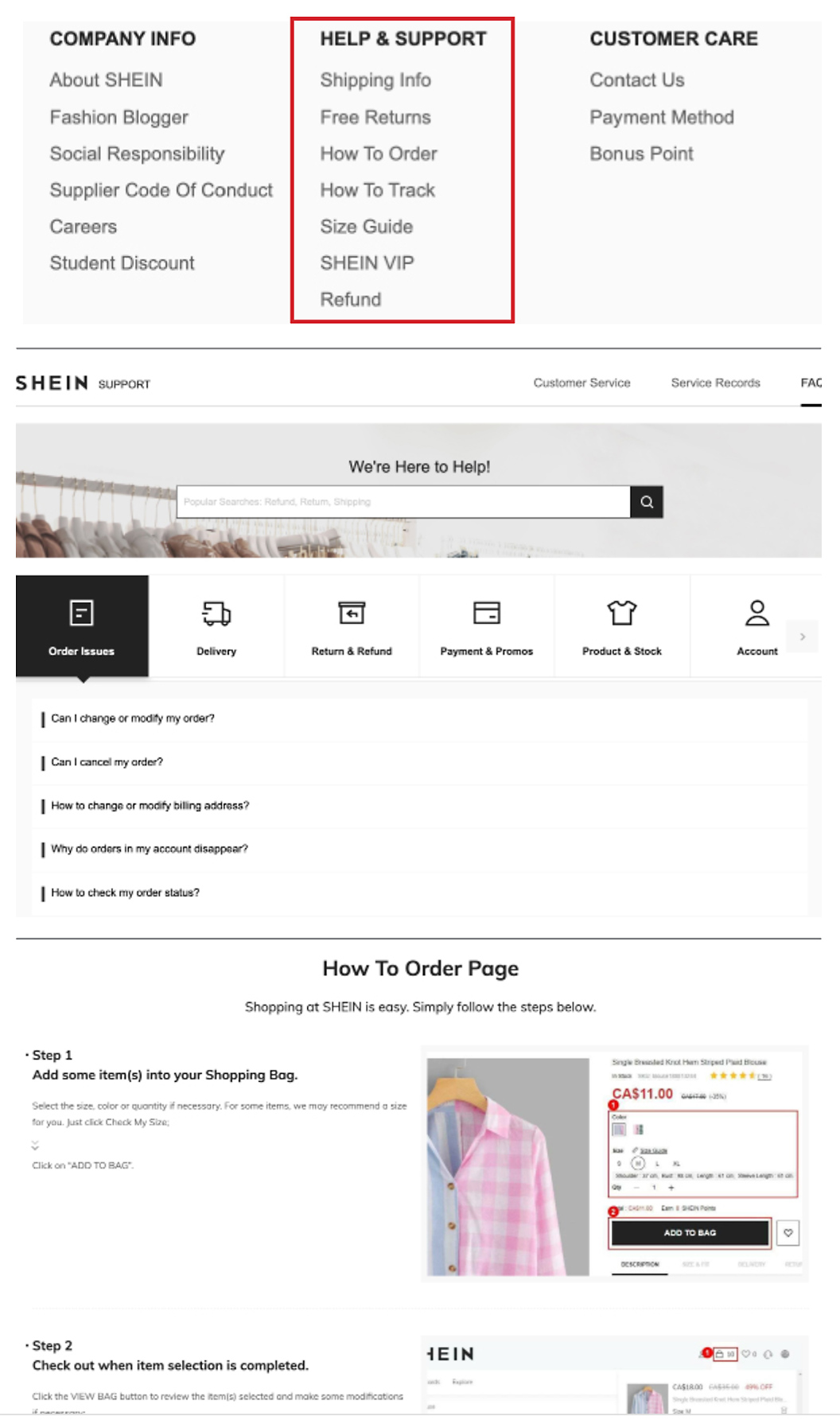
Shein’s Help Centre and Customer Care sections are extensive. Top Navigation offers Customer Service with a number of questions and topics that users may inquire about. Footer offers seven links to various helpful sections of support. There are questions that users might have, plus a search area for users’ specific questions. One of the most helpful ones is How to Order—it walks users through the process one step at a time with relevant screen shots. Throughout the Shopping Cart and Checkout pages, users can take advantage of pop-up tips and popovers designed to not only help users but also speed up the process.
Recommendation: How to Order link could be more prominent since many users probably won’t even know that it exists. Given the large number of customers that Shein enjoys, it would be helpful to add a WebChat.

3.) Ways to Test
• Usability Tests
• Tree Tests
• 5-Second Test
• Accessibility Test (Assignment example)
• Usability Tests
• Tree Tests
• 5-Second Test
• Accessibility Test (Assignment example)
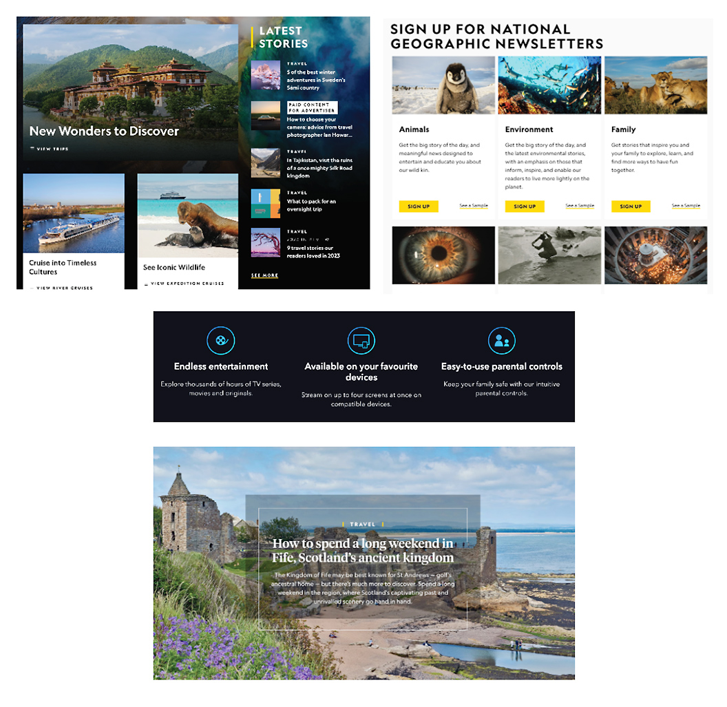
National Geographic has been considered one of the world leaders in geography, cartography and exploration. Given its great reputation, I had very high expectations and ideas what their website would look like. And right away, at first sight I could tell that the creators spent a lot of time and consideration while brainstorming its look & feel and functionality. The website is well-laid out, clear and clean, eye-catching and with intuitive navigation. But does it also meet the level of accessibility compliance to satisfy the needs of users with disabilities? Well, I found many positives but also some negatives.
1) Images: Alternative text “Alt”: 🙁
To my big surprise, none of the images on the website have Alt tags assigned to them. Users with sight disabilities will not be able to find out what kind images are featured on the website since their Screen Readers will have no description text to read.
Recommendation: include Alt tags on all images—it’s easy, it makes the website more accessible and gives users a much better experience.
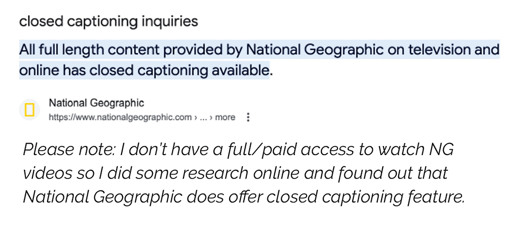
2) Video: Closed captioning: 🙂
Closed captioning has become one of the business standards and I’m very happy to see that National Geographic includes this major accessibility feature. There are many users with hearing disabilities or those learning the language that will greatly appreciate it.
Recommendation: none.
Closed captioning has become one of the business standards and I’m very happy to see that National Geographic includes this major accessibility feature. There are many users with hearing disabilities or those learning the language that will greatly appreciate it.
Recommendation: none.
3) Ability to “Tab”: 🙂
All users with physical disabilities or temporary injuries will love this feature—forget the mouse and use just one finger to tab your way through the website.
Recommendation: none.
All users with physical disabilities or temporary injuries will love this feature—forget the mouse and use just one finger to tab your way through the website.
Recommendation: none.
4) Location—Do I know where I am?: 🙁
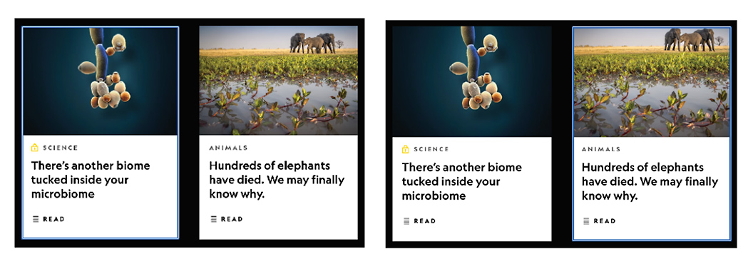
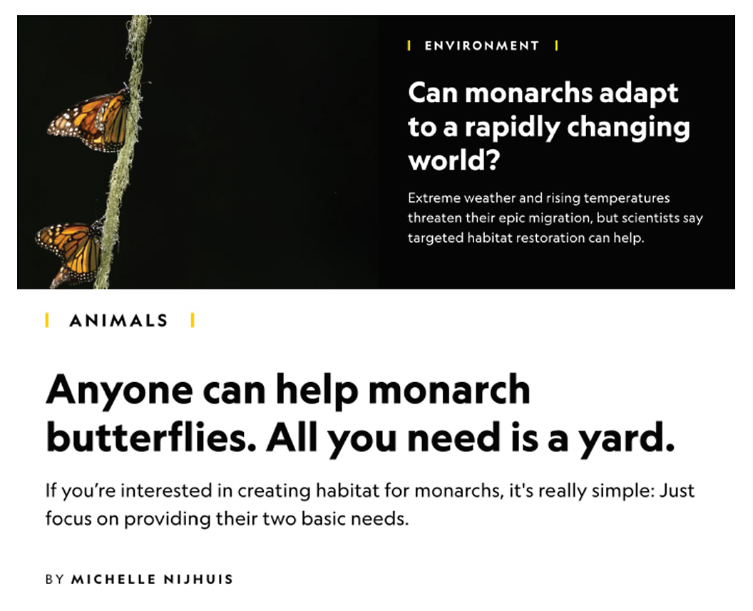
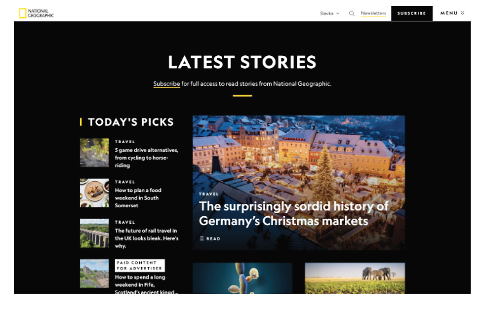
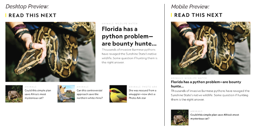
My first thought was “Great, I see breadcrumbs on the pages”! However, after browsing through the website I came to realize that the breadcrumbs are very vague and telling users only the category page but not the subcategories/stops in between. Some of them even change the categories, which is very confusing. For example, I chose Environment category, then clicked on Monarch butterflies, then I followed two other links within the same article, but under breadcrumbs, I could only see “Animals” category, no path to help me figure out how I got from Environment to Animals.
Recommendation: include the full path—all breadcrumbs/all subcategories users are visiting, don’t let them get lost.
5) Text: Reading level: 🙂
Content of the website is well-written and simple enough to be understood by users with roughly 9 years of primary education. Having said that, there are some articles that use more technical language and specialized terminology but it is to be expected with this field of information. However, writers use the simpler English jargon to explain topics and reference the Latin terminology only in the brackets.
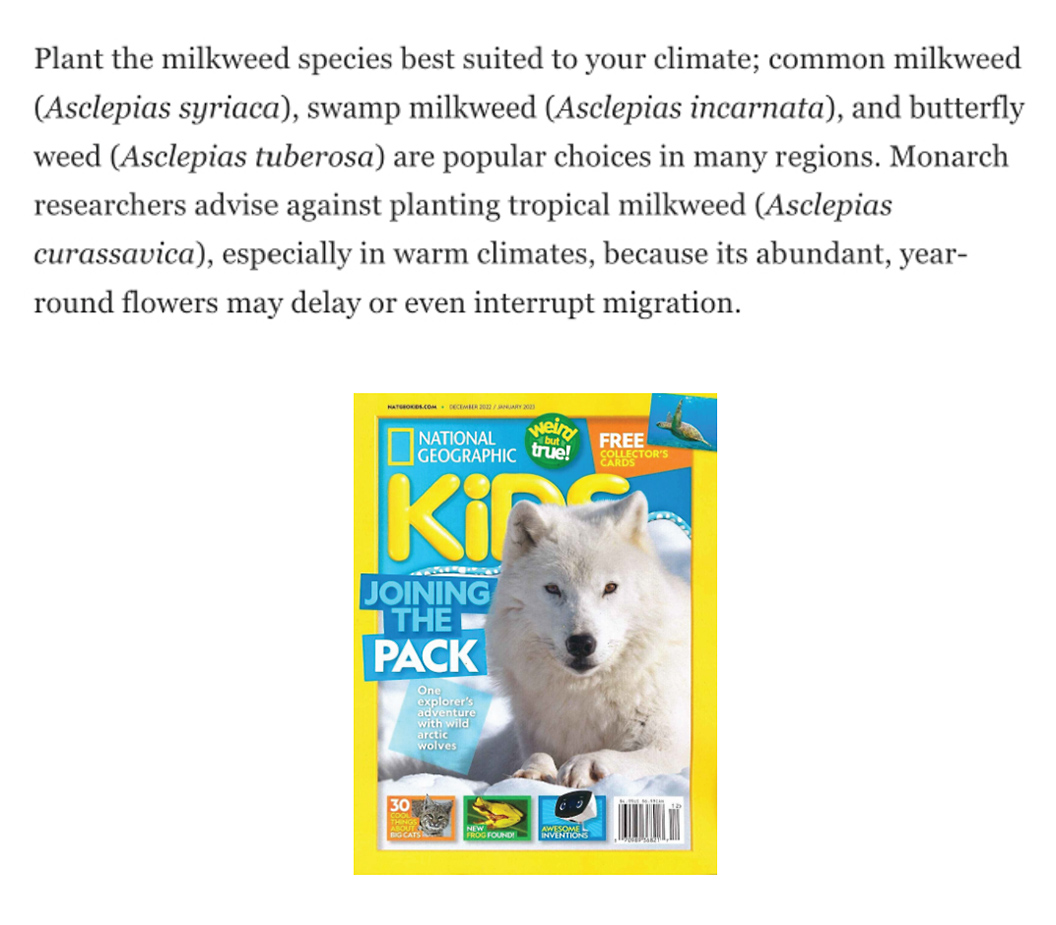
I would also like to point out that NG produces National Geographic Kids that focuses on all the subjects of most interest to kids ages 6 to 14.
Recommendation: it might be quite a jump from NG Kids to NG for adults so may be creating another National Geographic Young Adults for ages 15-20? (But I might be stretching it…).
Content of the website is well-written and simple enough to be understood by users with roughly 9 years of primary education. Having said that, there are some articles that use more technical language and specialized terminology but it is to be expected with this field of information. However, writers use the simpler English jargon to explain topics and reference the Latin terminology only in the brackets.
I would also like to point out that NG produces National Geographic Kids that focuses on all the subjects of most interest to kids ages 6 to 14.
Recommendation: it might be quite a jump from NG Kids to NG for adults so may be creating another National Geographic Young Adults for ages 15-20? (But I might be stretching it…).
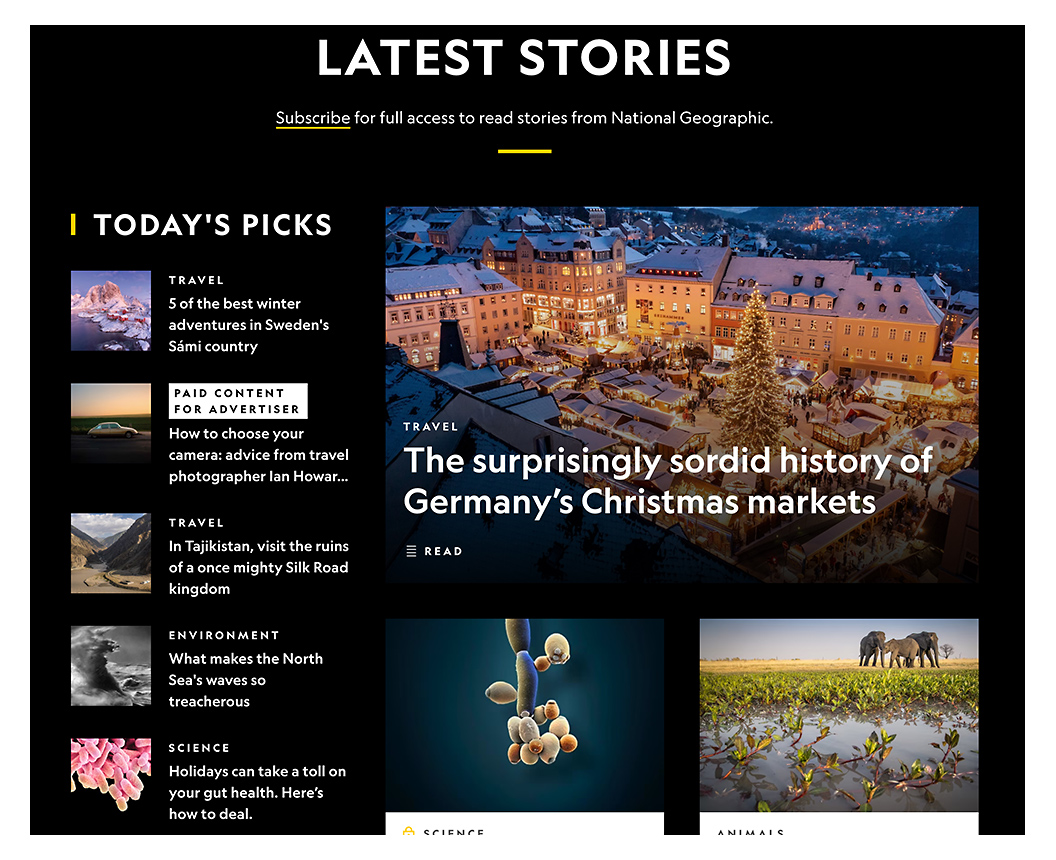
6) Page titles: are they descriptive?: 🙂
Page headings are very comprehensible, informative and to the point. Subheadings for subcategories and articles are also very clear and short—easy to understand at first glance. The short description below the subheadings is also very straightforward and direct—very easy to quickly grasp when scanning the page.
Recommendation: none.
7) Text: Colour contrast: 🤔
Most pages feature either white text on black background or black text on white background, which is considered the best practice (Contrast Ratio 21:1). Yellow (NG yellow) buttons with black label on top are very crisp (Contrast Ratio 14:1); and even the cyan-blue icons create a perfect contrast with the black background (Contrast Ratio 6:1)—all of them get a “pass” on the contrastchecker website (https://webaim.org/resources/contrastchecker/).
However, the white copy with a screened black background on top of images is a potential problem for users with sight disabilities—especially the description copy below the heading is very hard to read.
Recommendation: either make the black background box more solid/less screened, or remove the description copy and just add a link “read more”—the heading is descriptive enough.
8) Text: Resize text: 🤔
Majority of the text on the website is large enough for most users. However, there are article pages that include smaller text that some users might want to enlarge—but alas—there is no way to change the size. I checked the global navigation at the top, also the footer links but couldn’t find anything. For such a big company, having the option to resize the text should not be a problem.
Recommendation: just include the option to enlarge the text.
9) Text: Spacing: 🙂
I checked the text spacing while I was resizing the browser window and in all cases the text was legible, clear and perfectly spaced. I also changed the screen view (monitor resolution) to check how the text will behave but I didn’t find any issues.
Recommendation: none.
I checked the text spacing while I was resizing the browser window and in all cases the text was legible, clear and perfectly spaced. I also changed the screen view (monitor resolution) to check how the text will behave but I didn’t find any issues.
Recommendation: none.
10) Focus order: 🙂
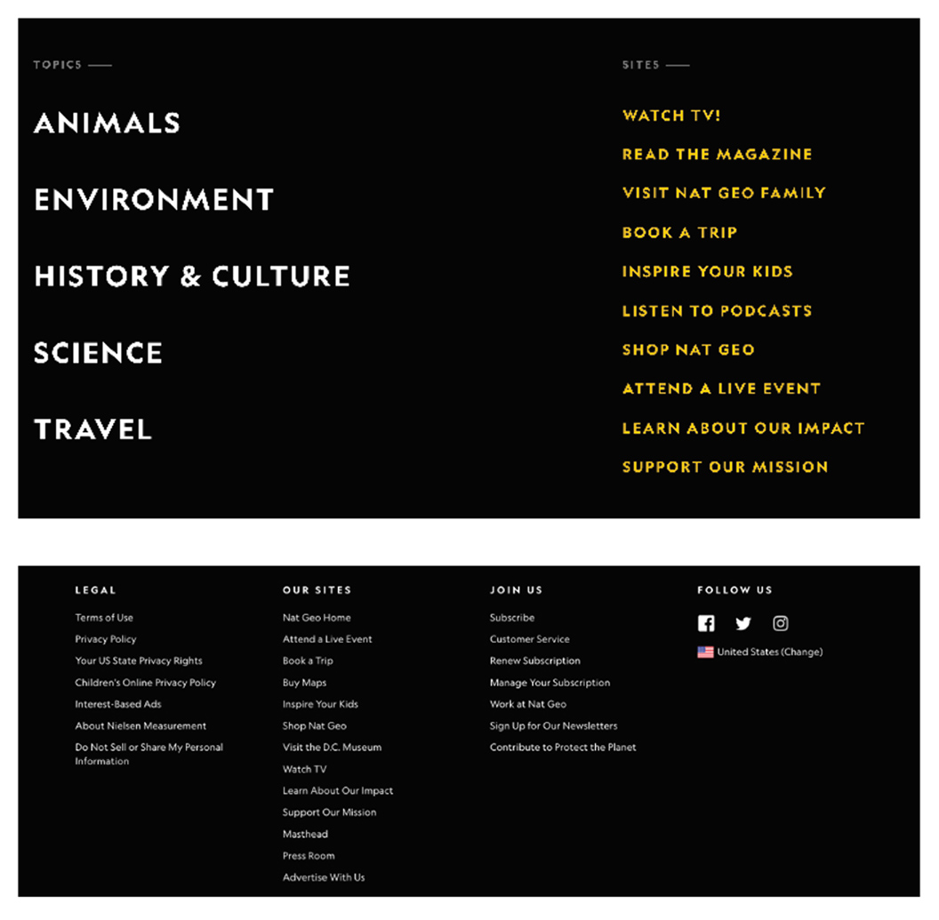
Both the Top Navigation and the Footer menu follow a logical and intuitive order of links. The Top Navigation focuses on users’ immediate needs and reasons of visiting—it offers links to most interesting, informative and valuable pages. On the left, it’s the main and most engaging categories; on the right, it’s a list of many options that users can choose to view, learn and get involved.
The Footer menu offers links to important information about the company, website itself, legal terms of use, media and help—important but secondary on the level of immediate needs.
Recommendation: none.
(However, getting back to contrast: I find the yellow text on black a bit harsh on the eyes. I checked the contrastchecker and just like black text worked well on yellow background, yellow text on black background also got a green “pass” (Contrast Ratio 14:1). However, I still find it rough—I’d tone the yellow colour down to a lighter shade.)
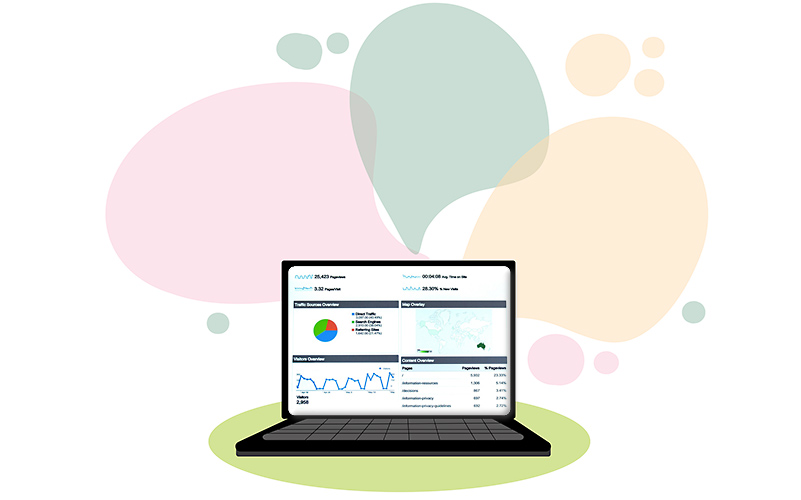
Listen is listed as the last phase of research, but it doesn’t mean that we don’t listen throughout the research and design cycle. The difference is that at this point we’ve already launched the app / website and the product is live.
We conduct surveys, monitor and analyze website’s traffic, search queries, drop-offs, bug reports, etc., and gather feedback from users in real time. We monitor their behaviour, problems, successes and frustrations and identify areas for improvement.
Come to think of it, this might be the most difficult phase of the process—we’re so close to the “finish line,” yet, there is still so much to do. The final corrections, revisions and amendments are crucial. But as the saying goes “without work, there is no cake”—and what a great and delicious reward it is when the cake is perfectly baked!