Prototyping
The Key Points of My Process:
Prototype is a preliminary version of a product (system) to test and validate design ideas and user interface before the final implementation.
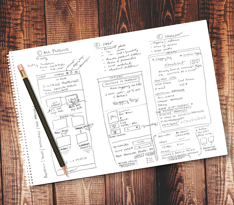
• Paper Prototyping/Sketches: I started with quick and low-tech drawings to put down my thoughts
• Low-Fidelity Prototypes: Once I’ve collected my thoughts, I created basic, rough representations with a focus on the overall structure and flow of the interface
• High-Fidelity Prototypes: After a few improvements of the low-fidelity prototypes, I moved on to detailed and realistic representations with visual design elements, interactions, and animations
• Iterating Process: To gather feedback, I created multiple versions of prototypes and refined the design until user needs and expectations were met
• User Feedback: Helped me to get direct user input about the website’s design, functionality and overall experience
• Final “Sign-off” and Development: After a number of necessary revisions I was ready for the final approval. I walked the client (my teacher) through the process, I combined the requirements and objectives with produced low- and high-fidelity wireframes, and presented the final prototype for her approval.
Prototype is a preliminary version of a product (system) to test and validate design ideas and user interface before the final implementation.
• Paper Prototyping/Sketches: I started with quick and low-tech drawings to put down my thoughts
• Low-Fidelity Prototypes: Once I’ve collected my thoughts, I created basic, rough representations with a focus on the overall structure and flow of the interface
• High-Fidelity Prototypes: After a few improvements of the low-fidelity prototypes, I moved on to detailed and realistic representations with visual design elements, interactions, and animations
• Iterating Process: To gather feedback, I created multiple versions of prototypes and refined the design until user needs and expectations were met
• User Feedback: Helped me to get direct user input about the website’s design, functionality and overall experience
• Final “Sign-off” and Development: After a number of necessary revisions I was ready for the final approval. I walked the client (my teacher) through the process, I combined the requirements and objectives with produced low- and high-fidelity wireframes, and presented the final prototype for her approval.
Wireframes to a High-Fidelity Prototype
This school assignment was focused on creating a high-fidelity prototype in Figma—with some extra bells and whistles—that would look “live,” just like a real website.
Naturally, I started with sketches that evolved into low-fidelity wireframes and after some revisions and colour additions, turned into high-fidelity wireframes. After some feedback and some improvements, I created a High-Fidelity Prototype that was ready for client’s/stakeholder’s feedback and testing.
Naturally, I started with sketches that evolved into low-fidelity wireframes and after some revisions and colour additions, turned into high-fidelity wireframes. After some feedback and some improvements, I created a High-Fidelity Prototype that was ready for client’s/stakeholder’s feedback and testing.


Once again, I dived into sketching keeping in mind that the website had to be well designed, functional, easy to use, fresh and with a clear sense of identity.
Once my sketches reflected the vision I had, I jumped in Figma and created low-fidelity wireframes for a mobile platform, which I find harder to design for (little space!). I got some feedback from my friends (and teacher) along the way and incorporated their suggestions into high-definition wireframes with colour and images.
My next step was to create a prototype for the website—a visual tool for user testing (to make sure it meets the user needs and expectations) and stakeholder’s review.
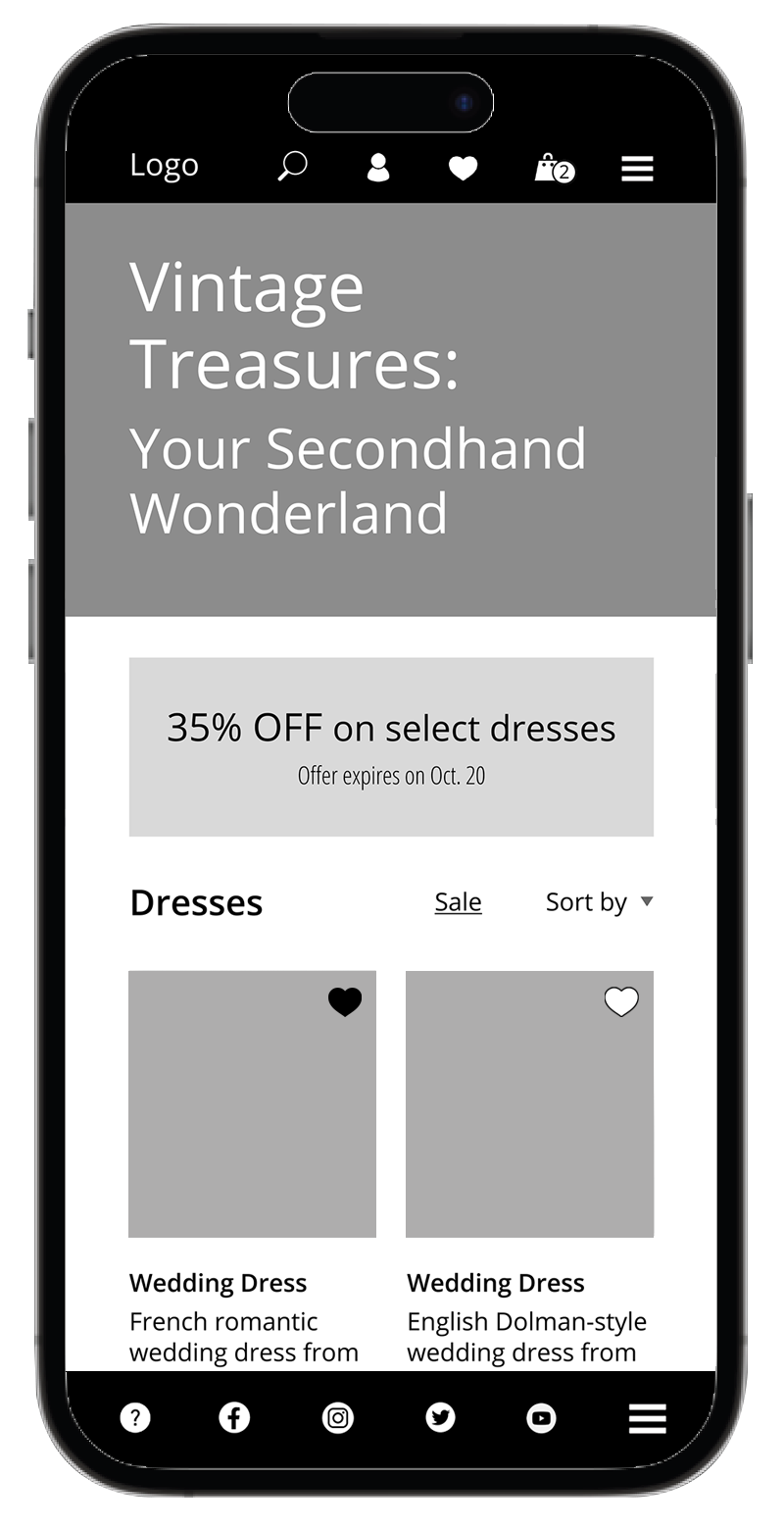
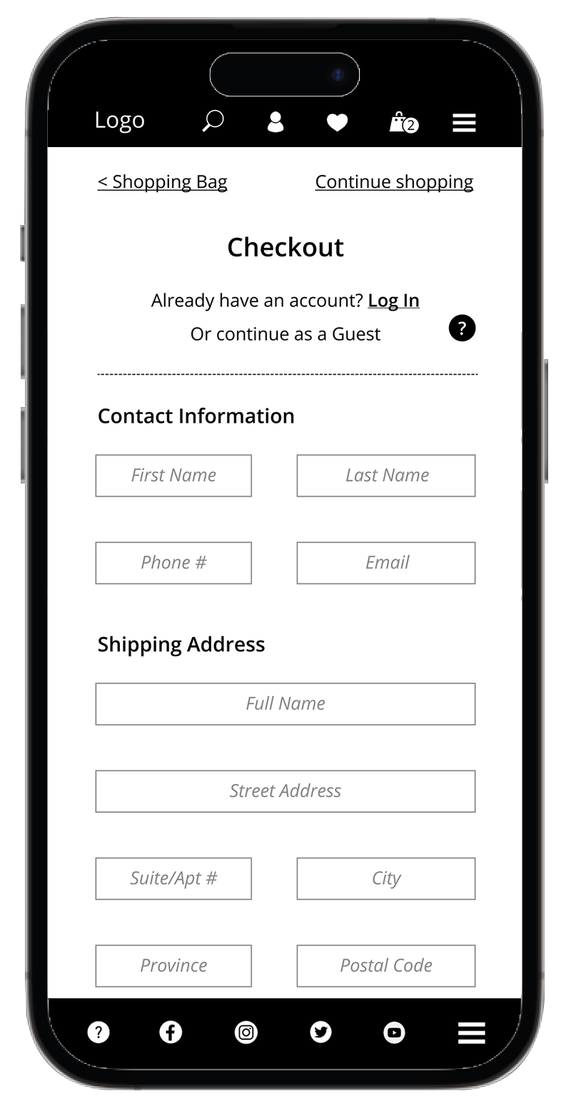
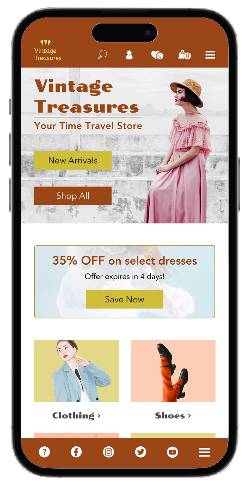
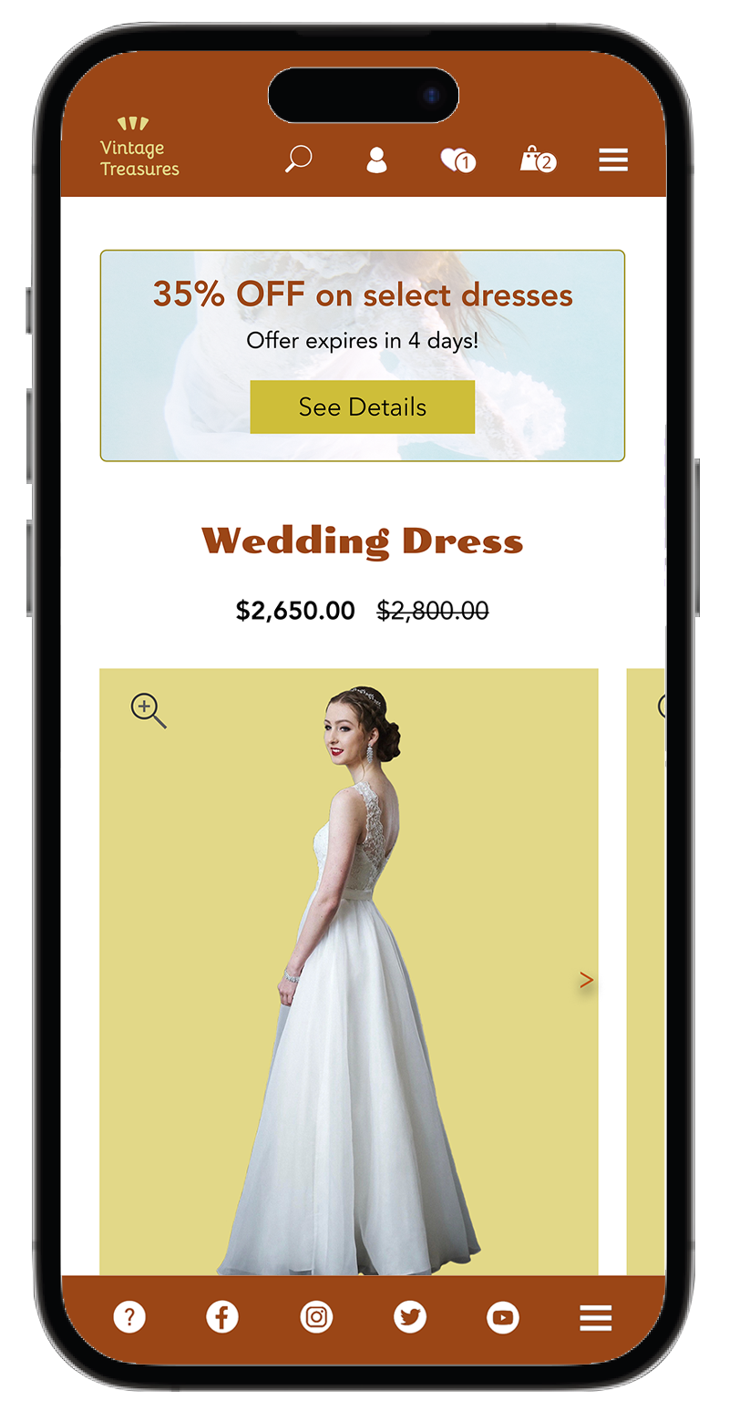
As usual, I decided to keep the Navigation Bar simple and so I included only the most important links/buttons and icons. There is no need to overwhelm users, they know (since most mobile websites and apps stick to the same idea) that the rest is hiding in the hamburger menu.
I chose a large Hero Image with a clear headline right at the top to make sure that users can immediately tell what the website is about. (The woman with a 60s-style haircut wearing a vintage dress carries a message of a nostalgia for old yet beautiful.) The buttons are also positioned at the very top to be seen without any unnecessary scrolling—I don’t want to lose anybody, not even the impatient users.
We all love good deals so I inserted a promotion box right below the Hero Image—it’s a perfect way to engage new customers and keep the “old” ones happy.
I thought it would be very helpful to list all the merchandise categories on the Home Page to, again, let users see at first glance what the store offers. Some people prefer to scroll, some favour clicking on the menu—this is a simple way to keep everybody satisfied.
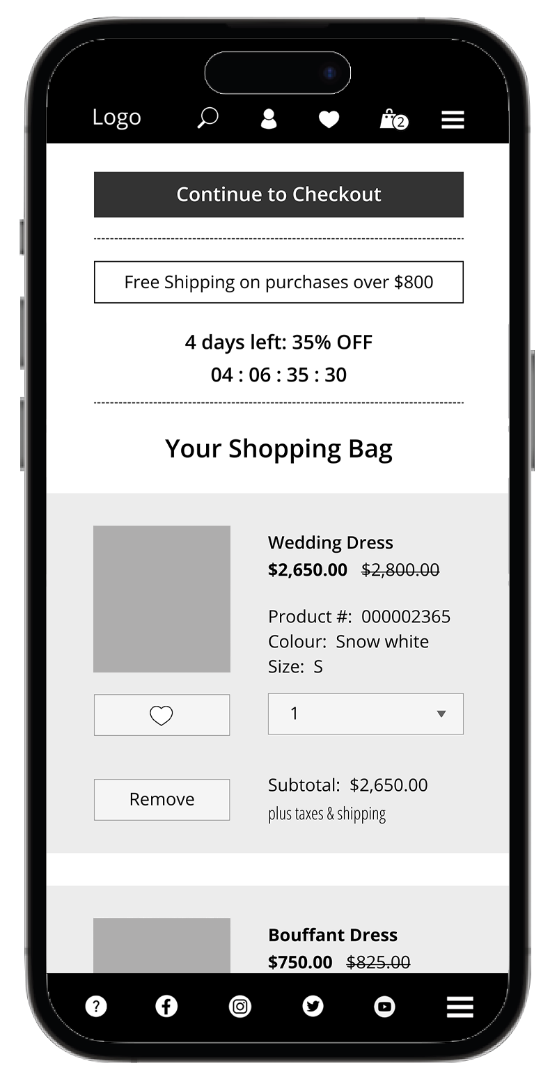
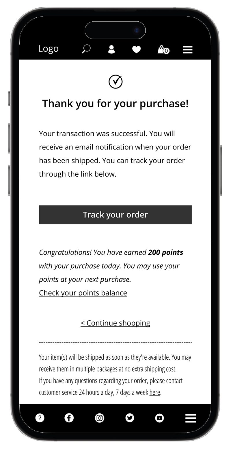
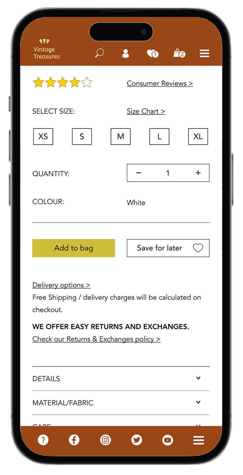
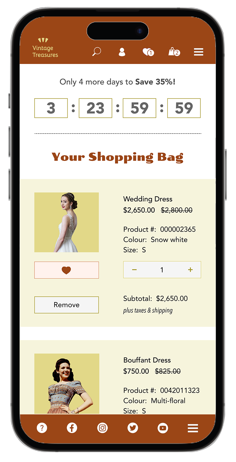
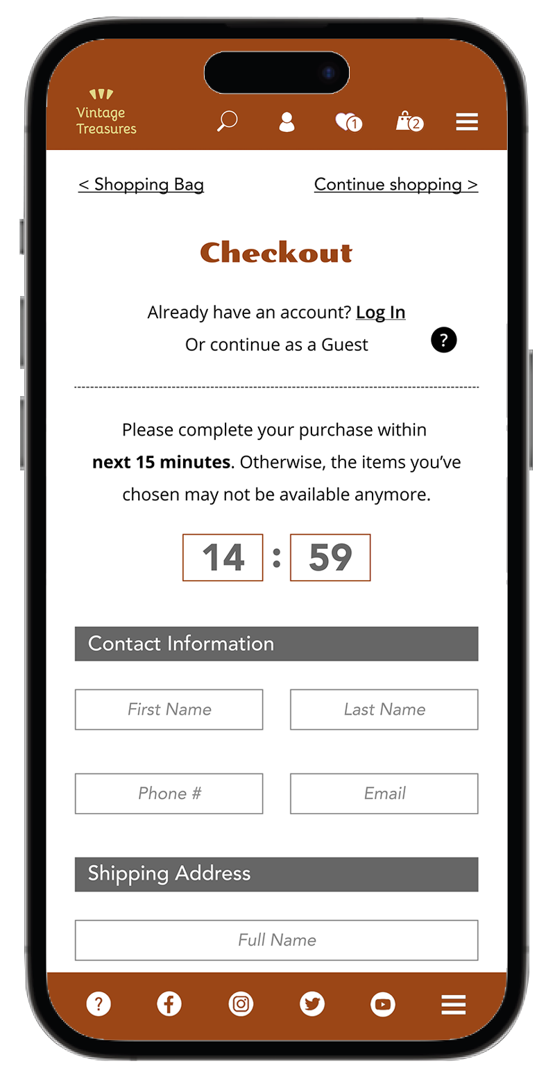
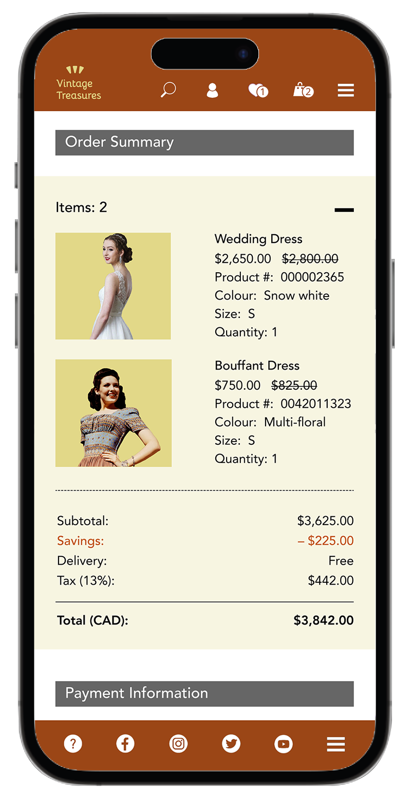
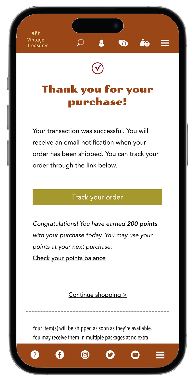
Throughout the site I paid attention to clear and intuitive navigation. I think it’s important that users always know where they are, what each button or link label means. They should not feel trapped and find themselves committed to a purchase without knowing how they got there. They always need an option to cancel and start over again, if they choose so (unless, they’ve already made a purchase, then we get into returns/exchanges).
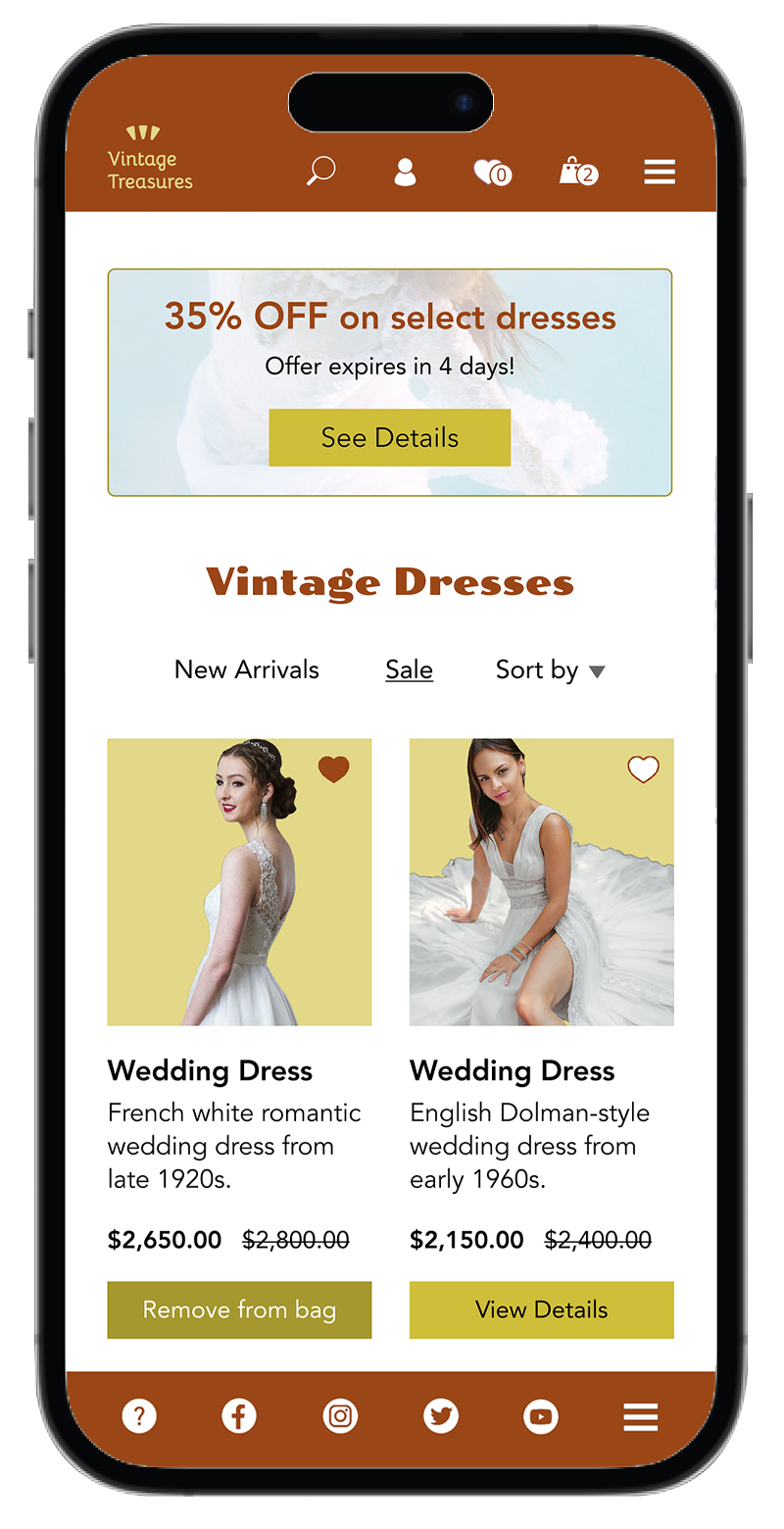
Having not enough choices is bad but having too many choices can be even worse—we know it from many business surveys and also from our own experience. I categorized all merchandise into six main categories, included a search button (for the impatient ones) and also added a few extra options for those who don’t mind to scroll. There are users who’ll be searching for “I don’t know what I want until I see it” and I want to offer them a couple of extra helpful categories specific to a time era or a holiday.
We all enjoy showing off our favourite or best buys. Whether it’s an old record, a funky purse, or a Tiffany-style lamp. We have a desire to share the beautiful piece of history we found with others and so I dedicated a section to a Vintage Treasures Community. Customers can share pictures of their Vintage finds with others and thus promote the store itself.
When it comes to e-commerce sections and forms, I based them on other well-established online stores that have been successfully selling their products for years. There is no need to reinvent something that’s been working well for many other companies. They’ve done their research and all the hard work, let’s take advantage of it (with gratitude).
Sticking to simplicity is my goal. Users can find all the necessary links and information in the hamburger menu. And since we live in the age of social media, I included the links right at the bottom for convenience.
Branding & Visual Identity
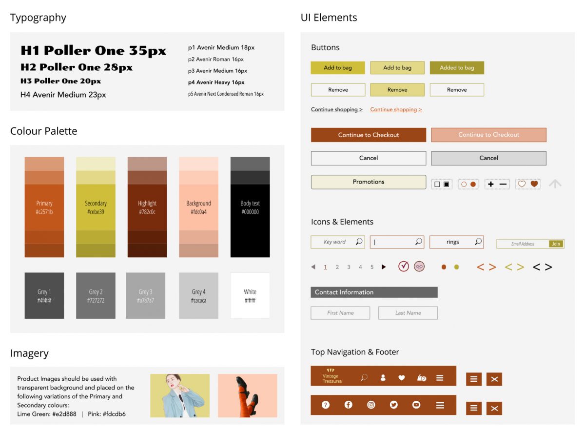
Creating Brand Guidelines for Vintage Treasures was a challenge. Searching for colours that were striking, yet, nostalgic at the same time brought me to the red colour family, and specifically brick-clay and maroon colours.
Brick-Clay represents prestige, social status, or wealth, and is often associated with older or more classic styles of architecture.
Maroon conjures feelings of spirituality, wisdom and calm. According to colour psychology, maroon is associated with control, responsibility and thoughtfulness. It can even be associated with the season of fall, as leaves sometimes appear maroon when they change colour.
Finding a complimentary colour was a bit easier. Even though my first thought was a mustard yellow colour, I decided to give it a bit of a twist and turn toward greens. I chose Green Tea colour that has a vintage look but with a modern flare.
Green Tea represents peace, harmony, tranquility and respect. And as any tea, it invites people to cleanse themselves of the day’s stress and focus on mindfulness.
So, let’s see what I’ll get when I combine prestige, fall leaves and respect—Vintage Treasures!
Conclusion
• Working on the Vintage Treasures website was a lot of fun. I have a number of friends who are keen vintage items collectors and so throughout the whole process I thought of them, their needs and expectations. They were also my study and research group before I commenced the project.
• Throughout the process I reminded myself how important it is to simplify the design to allow a proper and quick functionality and easy navigation.
• Working on wireframes was challenging as every time I tried to address one issue, ten more would arise. But that was also a valuable thing for me since it allowed me to deal with these issues in the beginning stage when nothing was set in stone and revisions were just one arrow or one button away.
• There was also a constant reminder in the back of my head that I’m not creating this website for myself but for a client/stakeholder and a large audience. It’s not about me, what I would like but what would potential Vintage Treasures customers want and need.
I truly enjoyed the whole process and felt a tremendous amount of satisfaction from every achievement along the way. I can’t wait to start working on another project.
‹ Click on the mobile phone to navigate to other pages or scroll down to see more.