CollArtApp is a fictional* App for artists—musicians, dancers, singers, songwriters, professionals or amateurs, who would like to connect and collaborate on various projects. Whether it’s a full-blown theatre performance, a small venue show, a traditional folk dance party or a night of just “jamming”, one can search for the like-minded artists or answer a “call” for collaboration on this App.
*A school project to develop an idea—from a User Experience Brief to Wireframes (including: Site Map, User Flow)
App Overview
FREE Access & Browsing
To post or respond to messages, user has to create a free account and become a member. All communication is done via CollArtApp until both parties decide to communicate directly.
Simple Skill Test
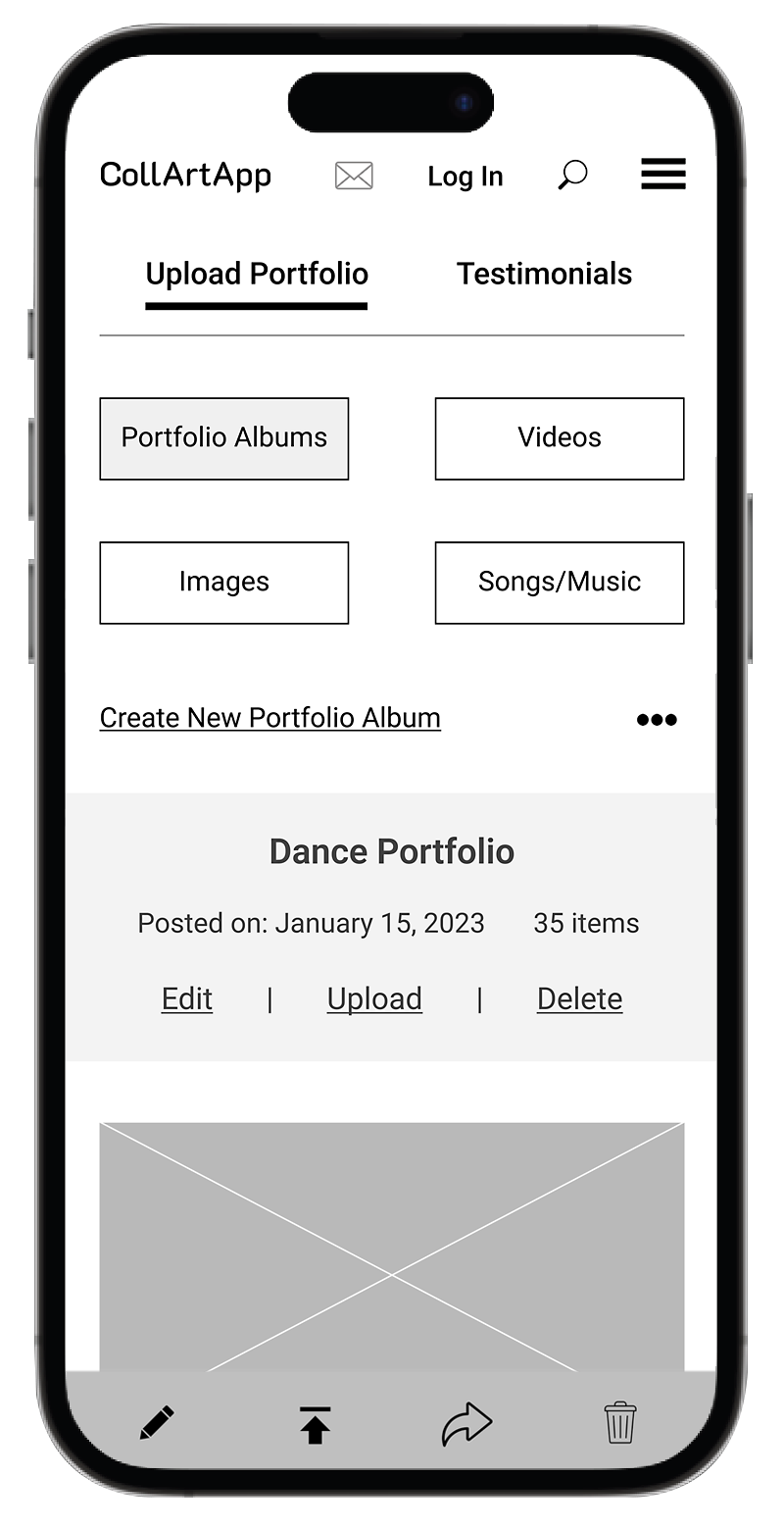
Members need to fill a quick skill survey describing who they are: i.e., musicians (what instrument they play), dancers, singers (which style), what level they are at: beginners to advanced, how may years of experience they have; should include links to “portfolio videos;” or must list name of their business, venue, band, gallery, location…
Optional Subscription
Members have a choice to subscribe to various alerts and email blasts (promotions, events, news) to stay informed. (For a small monthly fee, members can have ad-free experience, plus receive many other incentives.)
Objectives
We’ll have to make sure that this App speaks to all artists—the “weekend jammers”, the “gig-planners” and everyone in between…We’ll use simple and personal language (8th grade/high school level) to make sure everyone can follow and understand the App. We’ll let users choose the seriousness/gravity of their interest right off the bat. Their selections will open doors to the objectives of this App (what we are trying to achieve):
• Help artists to connect and collaborate with other artists—encourage cross-media collaboration
• Help new/starting artists get noticed and learn to network
• Organize online & in-person “Launch Pads”—introductory performances
• Help studios “sell” (rent) their studio time, venues fill their low-demand time slots
For this App to work well:
• Must be safe and well protected—privacy!
• Must create a successful marketing campaign for the App—social media, website, word-of-mouth
• Must do a Survey: what post-Covid artists need most to get back on stage and succeed
• Must attract influencers to increase presence online
• Artists must have some minimum proficiency in the art field they wish to pursue (a mandatory survey about the skills, experience, accomplishments to be filled out when creating account)
Business Goals
• Revenue (profit) from paid advertising: venues, studios, bars, schools, music stores…
• Subscription: to promotions, events, news in the art world, etc., to create own CollArtApp Email Database
• Offer Email Campaign service to businesses targeting the “art” audience with their products & services (art galleries, schools, online stores)
• Crossover to Travel business: connect with travel agencies offering art-based tours worldwide and market to members for a discounted price
Target Audience

Artsy Lorenna
33 | Graphic Designer
“Everything you can imagine is real”
Pablo Picasso
A single professional, no children, a well-established city dweller, an art enthusiast.
Repeat activities:
• joins dance classes three times a week
• attends workshops regularly
• travels to the country(ies) of the (chosen) dance origin to learn from the source/guru, etc.
Motivation:
• love for dance
• meeting like-minded people
• being part of a community
• staying active and feeling challenged
• bragging rights.
Frustration:
• too busy to search for artists willing to collaborate
• it’s hard to find people serious enough to commit to collaborations
• wouldn’t even know how to begin her search.

Singing guitarist Jerry
56 | Music Teacher
“Art is never finished, only abandoned”
Leonardo da Vinci
A married professional with adult children, well-established suburb dweller, art enthusiast, member of a local art community.
Repeat activities:
• enjoys dance outings
• attends theatre, symphony and opera frequently
• travels to rediscover the family roots (countries of his ancestors).
Motivation:
• love for music, anything and everything artistic
• meeting like-minded people
• being part of a community
• feeling challenged
• bragging rights.
Frustration:
• it’s hard to find people serious enough to commit to collaborations
• doesn’t enjoy the process of searching
• wouldn’t even know how to begin his search.
Measures of Success
• Steady rise of subscribers (members), growth in traffic, increased time on the App
• Profit-making from advertising by studios, schools, costume and music stores, etc., which can be used to promote and support new artists
• Expanding with the App to include whole Canada (in stages, province by province) within 1 year
• CollArtApp becomes #1 Art App in Canada for collaboration and networking within 5 years
Scope & Design Requirements
To create CollArtApp—a downloadable App & website—we need the following:
• Start with a survey and further research to learn what users are looking for/what their needs are
• Continue with structuring functionality and content to ensure that users can easily navigate through
• Focus on user interface to organize, locate, share, view content in CollArtApp
• Focus on easy & intuitive navigation and customization options; Speed—highly-optimized content!
• Important: secure login, e-commerce section for purchasing services; password recovery
• Create sections for web-chat, in-app messaging, CollArtApp community, deals/promotions, online events
• Enable upload/download, file sharing (with online edit features)
• Crucial: User Experience—easy, intuitive and personal to encourage repeat visitors
• Easy maintenance, no “shut downs” during upgrades and deployments; tracking error messages and notifying IT immediately, specific error messages with solutions and links to live Help
Competitors
I conducted an online search for similar Apps or websites but didn’t find anything. There are some apps focused on the Dance or the Music Communities only but nothing comparable to what we are proposing.
Similar Apps/Potential Competition:
Dance: www.danssup.com/; https://stagekeep.com
Music: www.musicgateway.com/blog/music-industry/music-business/best-music-collaboration-apps.
Even though there are no notes to compare or check what works well and what is failing—we can still get some inspiration…and we can think of it as good news since our idea will be new and unique—with a large audience keen to try it out.
User Stories
It’s important for us to gather enough information about users’ needs to better understand their goals. Then we can create solutions that will be beneficial to them and will satisfy their expectations.
Requests to consider (Sample User Stories):
App Functionality
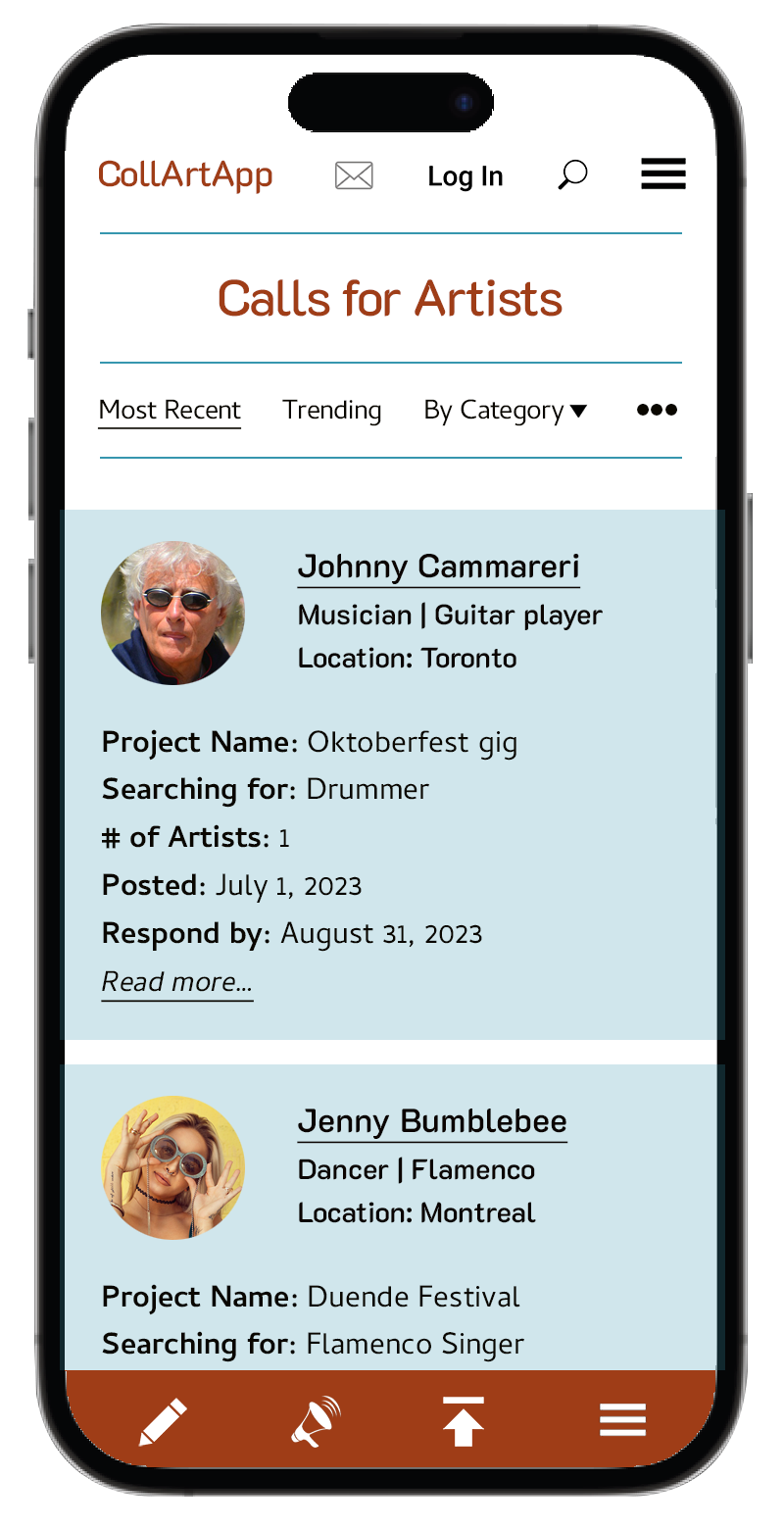
#1: As a user, I’d like to post a call for an artist so that I can find someone to do a show with me.
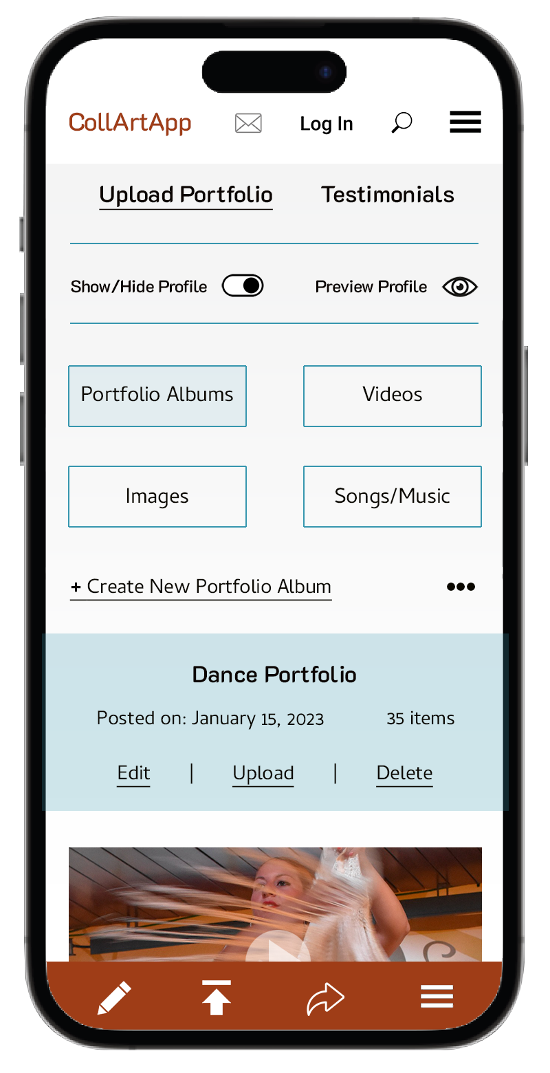
#2: As a user, I’d like to see some portfolio videos of the artists on the App so that I can decide if their skill level is appropriate.
#3: As a user, I’d like to be able to receive a notification if there is a post that matches my skills so that I can respond quickly.
#4: As a user, I’d like to choose an “ad-free” membership so that I can avoid distracting ads on the pages.
#5: As a user, I’d like to be able to advertise on the App so that I can promote my related business.
Navigation Bar
#1: As a user, I’d like the App to have an intuitive Navigation so that I can find my way easily.
#2: As a user, I’d like to have a direct link to My Space/My Account so that I can easily access the frequently used sections of the App.
#3: As a user, I’d like the Navigation to use simple language so that I can understand what each button does.
#4: As a user, I’d like the Navigation Bar to have a keyword search so that I don’t have to waste my time clicking on too many buttons.
#5: As a user, I’d like to be able to reach live/online Help so that I can find a solution to my problem immediately.
Site Map
If we want CollArtApp to work well, it needs to be very simple, intuitive, customizable and it must be safe. Users should feel that the app is very straightforward and leading them from point A to point Z in the best way possible.
(Before I started to line up my thoughts, I did a quick survey among my friends who seemed like the perfect future CollArtApp users. Unfortunately, it was not very helpful, as the result of my analysis was that all of them gave me a ”thumbs up” and “You’ve got it, just keep going”-kind of response. Well, then…here I go!)
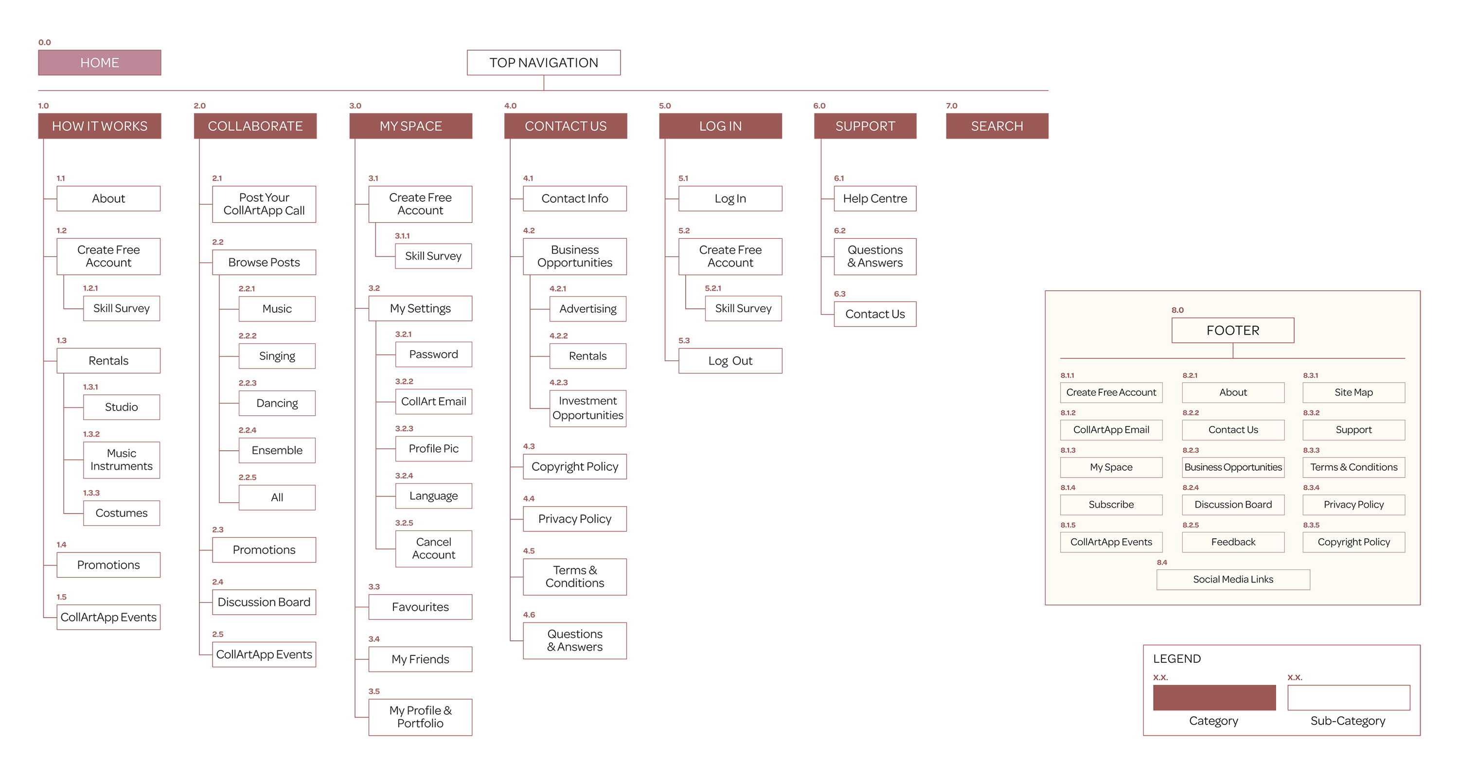
Keeping that in mind, I divided all my nods into six main categories (1.0 – 6.0)—Top Navigation buttons—plus Search button (7.0). At the end I collected the most important nodes that are buried in sub-categories and included them in the (8.0) Footer for easy access.
My Thought Process:
The beginning/entry point for most users.
It may sound too wordy or simplified but since this is the first of its kind App, many users will have no idea where and how to begin. I chose this category to introduce them to the App itself (1.1 About) and get them started (1.2 Create Free Account). Users will also learn about the variety of rental services (1.3 Rentals: 1.3.1 – 1.3.3), promotions (1.4) and CollArtApp community events (1.5).
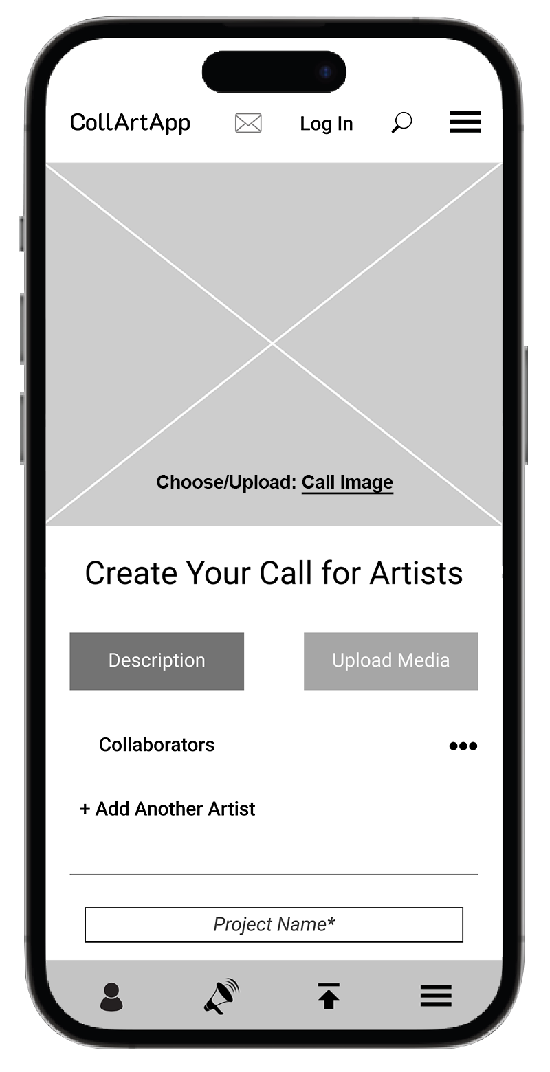
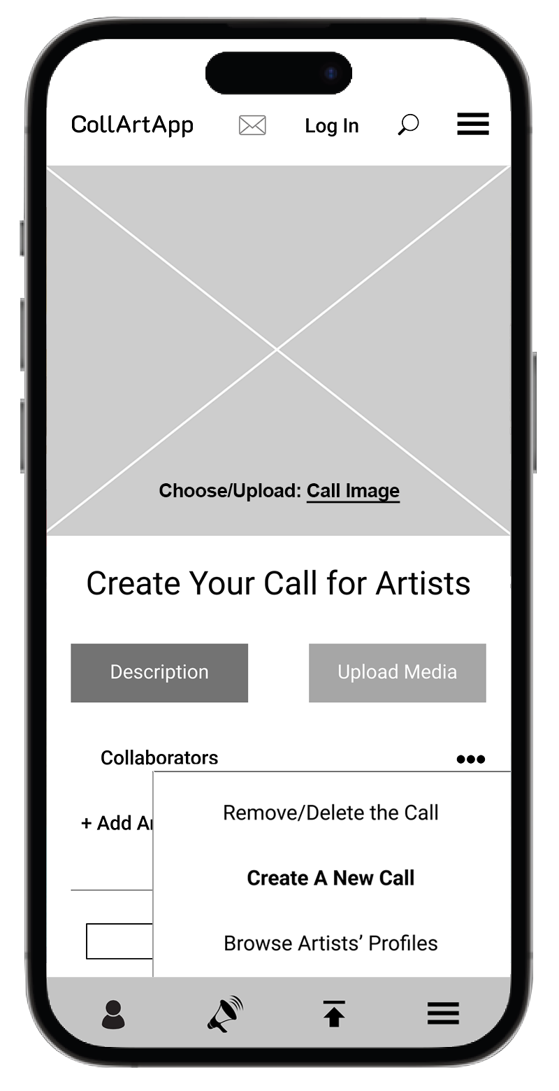
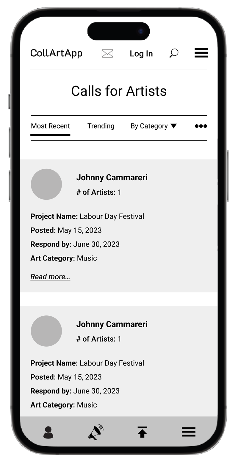
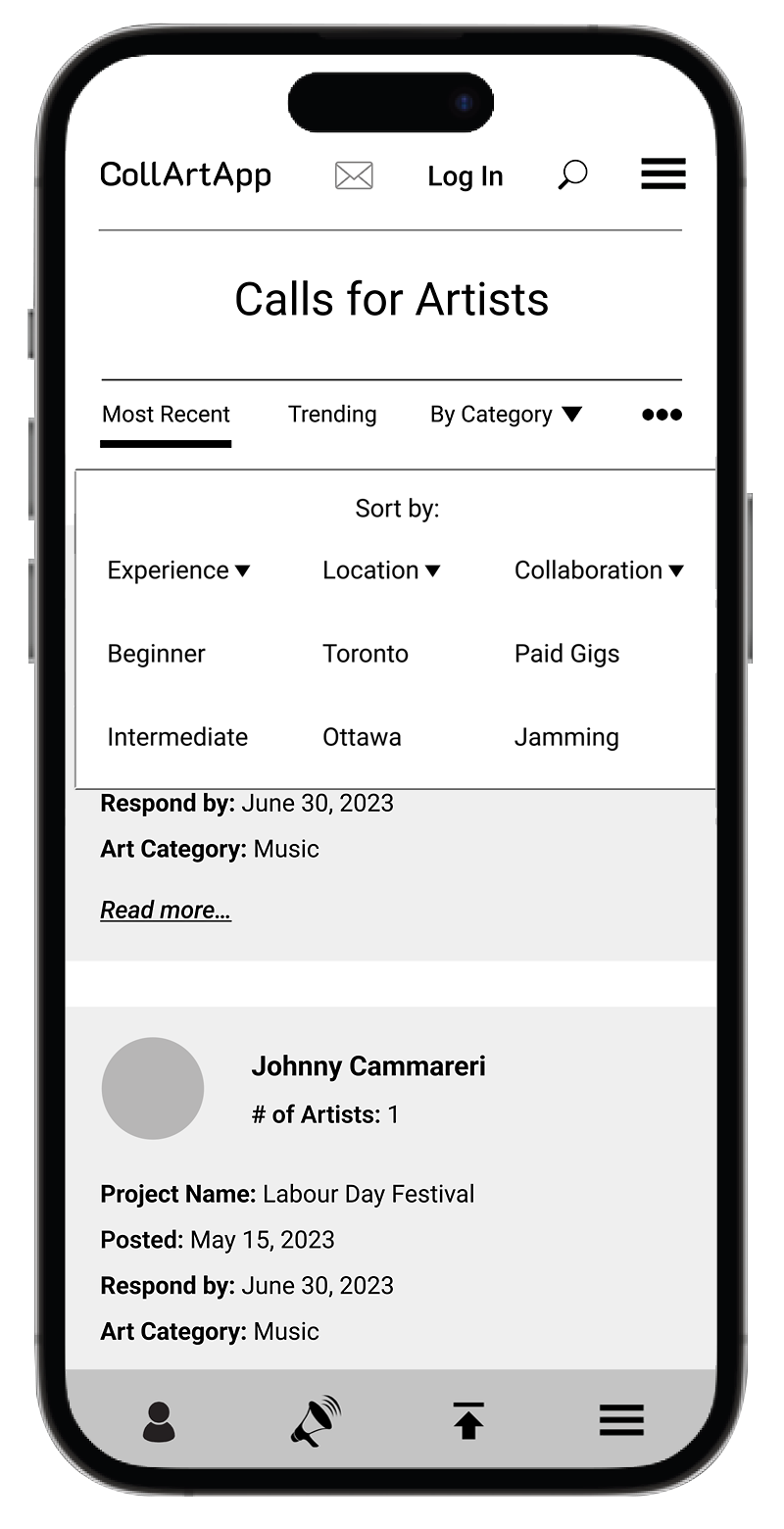
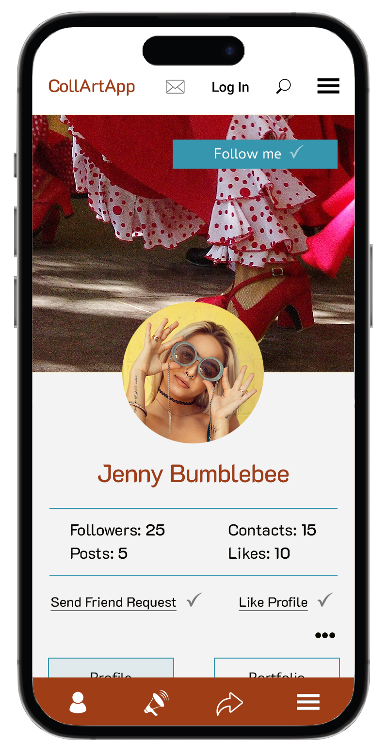
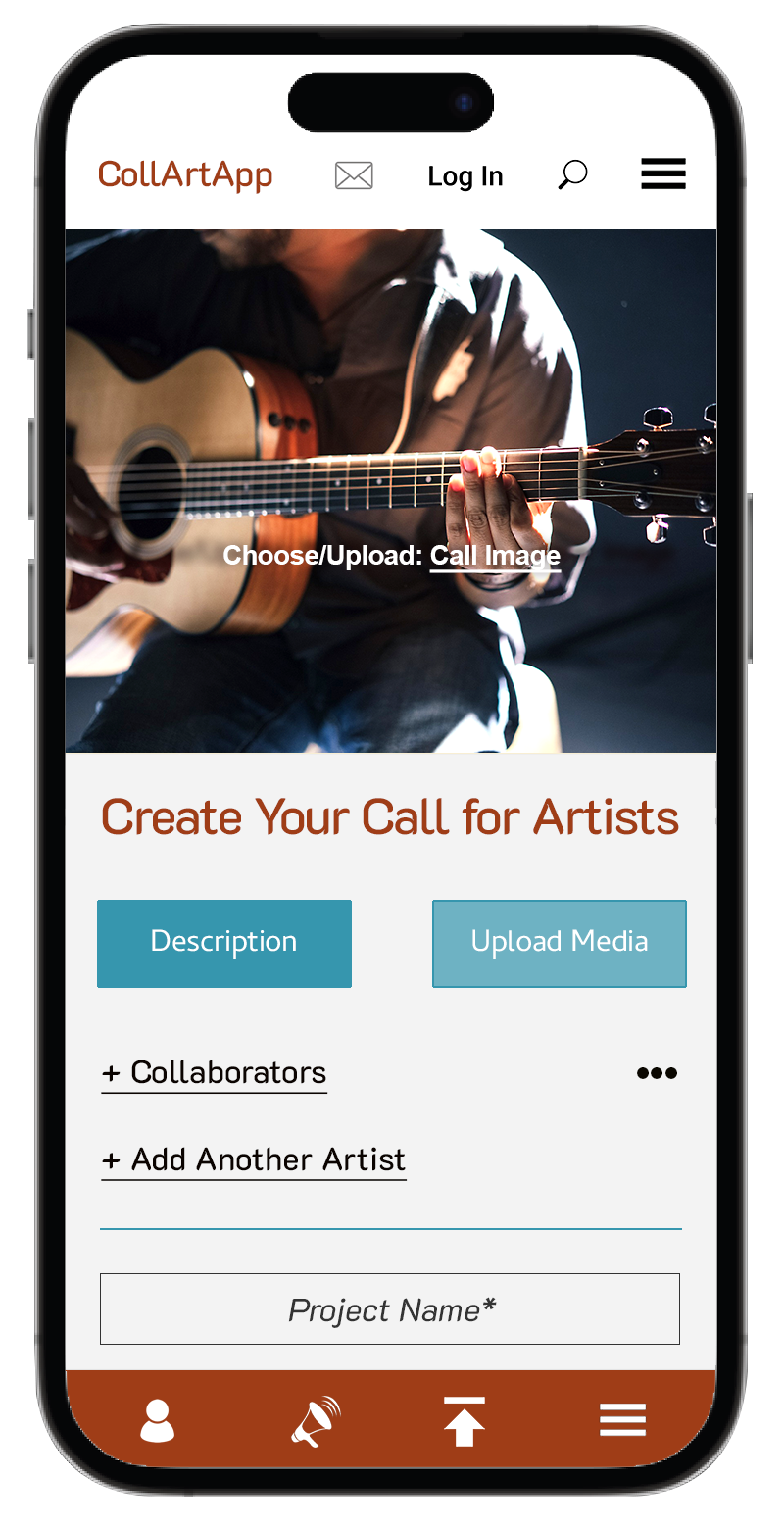
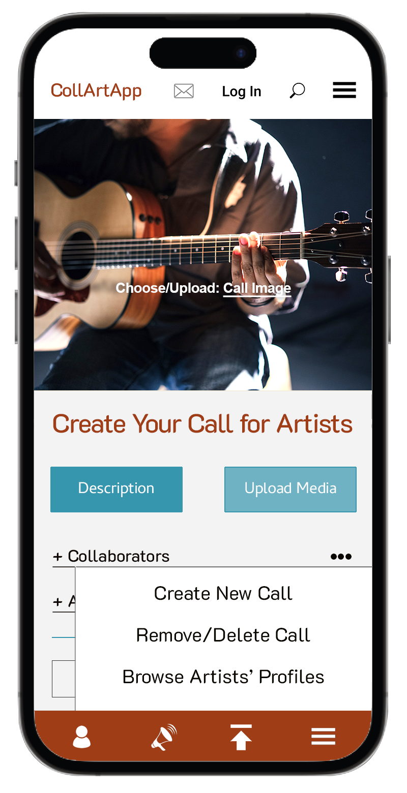
Once users learned about CollArtApp and created their accounts, they are ready to take step 2 and “do what they’ve come to do”—collaborate. A dancer searching for musicians to accompany her on her gigs can post a call for a guitar player and a percussionist (2.1 Post Your CollArtApp Call) with a full description and a link to her profile/portfolio (3.5). Or she can choose to browse the posts (2.2) and answer someone else’s call. But I think she should also have a choice to browse applicable members (I’ll include a filter for this search to narrow it down) and contact them directly. She can watch their posted portfolio videos and decide who will be a perfect match.
To keep this App evolving and “fresh” I need to find a way to not only attract new users but also make sure the current ones don’t get bored and find always something relevant to go back to. My best bet is to get them involved in the community—via community events (2.5) where they discuss their favourite topics and learn from other like-minded users (2.4 Discussion Board). I repeated Promotions (2.3) for convenience and also to remind users that they are special and we appreciate them.
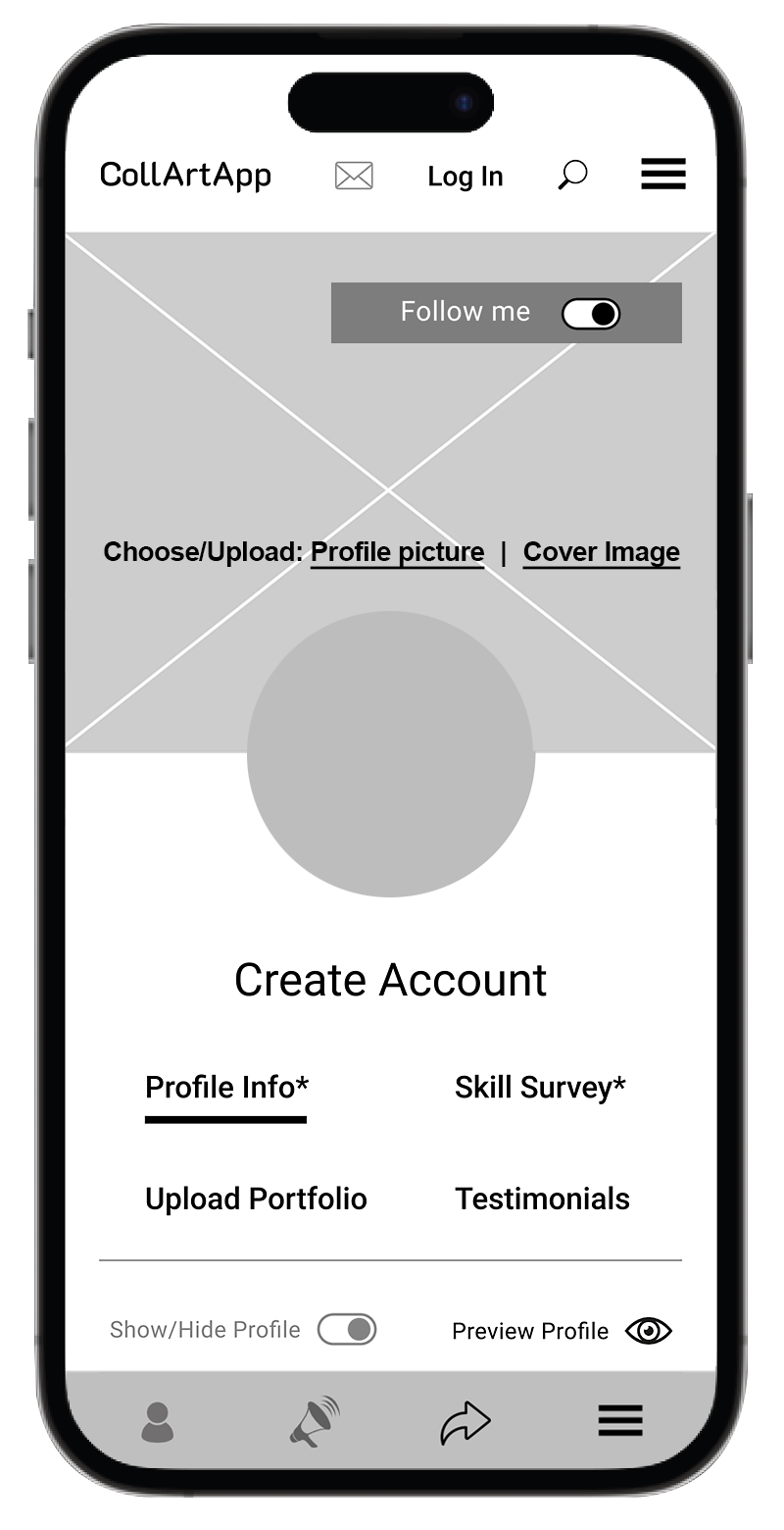
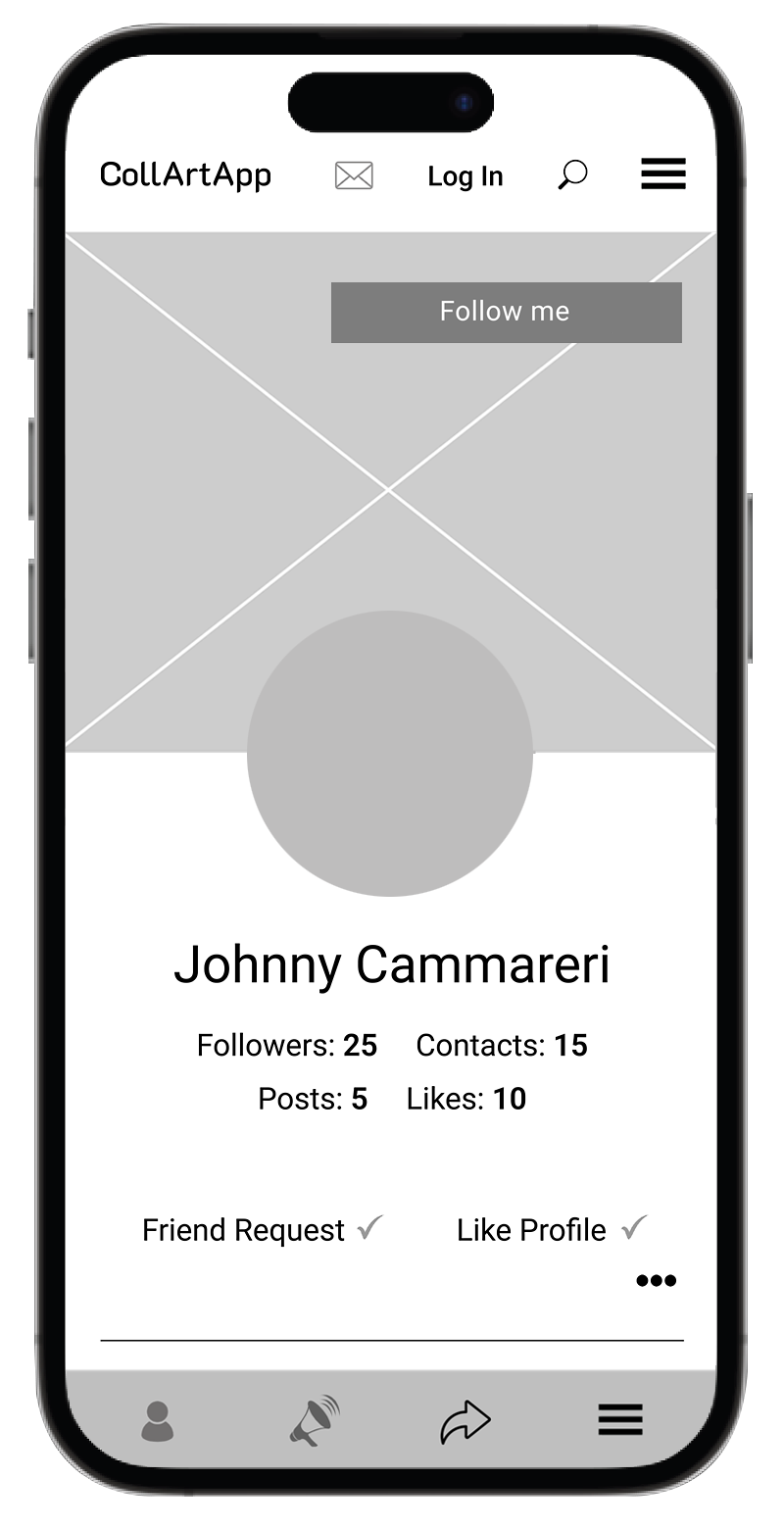
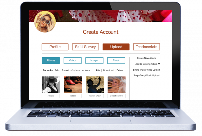
I created this category to house users’ personal information. One can create an account (3.1) or a second account, if needed. In My Settings (3.2) users can change their passwords (3.2.1), add profile pictures (3.2.3), access their CollArtApp email (3.2.2). In keeping with the community flare, users can quickly look up and reach their friends (3.4), plus also save and access their favourite pages, videos (3.3). I would like this section to be a “go to” area where users find the typical information they may need on a daily-basis. These days most apps use “MySpace” so users are used to it and will recognize it easily.
This category lists many important links: how to reach The General Public of Toronto (4.1), check the legal disclaimers (4.3 – 4.5) or look up the Q & A’s (4.6). I’m counting on users expecting the Contact info in the Top Navigation; it also adds credibility to the site.
If users are interested in advertising or posting rental opportunities on the CollArtApp website, or are seeking new business opportunities, they may want to check the (4.2) Business Opportunities sub-category (4.2.1 – 4.2.3).
As the heading says, members can Log In/Log Out, and non-members can create their accounts (5.2).
In this section we offer users three ways to solve their problems—they can access Help Centre (6.1) where they can search for the topic they’re having issues with; check Questions & Answers (6.2), or if nothing works, they can contact our IT department directly (6.3).
Again, users have grown used to getting help right there and right that minute on the apps so our App has to not just meet but exceed their expectations. I’d like to make sure that users get our help to solve their issues and don’t give up and leave. It’s impossible to create a perfect, problem-free app but it’s possible to have Help on-hand ready to solve the problems. That is what users will remember and talk about on social media.
This button is a must—a quick keyword search that will help users find exactly what they are looking for. Many users prefer to do a quick search instead of going through the Navigation Menu (even if they know where to find it) so I want to make sure that their expectations are met.
Includes all important and useful links that may be listed as sub-categories (and thus not seen right away), plus a very helpful (8.3.1) Site Map, (8.4) Social Media Links and a button to subscribe (8.1.4) to our monthly newsletter (full of ideas, tips, what’s coming, and promotions).
This may come as a surprise, but many people do use the Footer Menu—especially the older generation. After some research and interviews I realized that it’s just as important part of the site as the rest.
Our mobile App deals with the Footer differently—everything is more to the point and more sparse—but the desktop version, which will serve the older generation more than the younger one, needs to be in more detail.
User Flow
Becoming a CollArtApp member should be a very easy task and there should be more than just one way of accessing the sign up page—the Create Free Account page. It has become a rule that all apps (all that I can think of) require users to create their accounts with passwords so it should be no surprise to future users of CollArtApp that they’ll have to follow the same path.
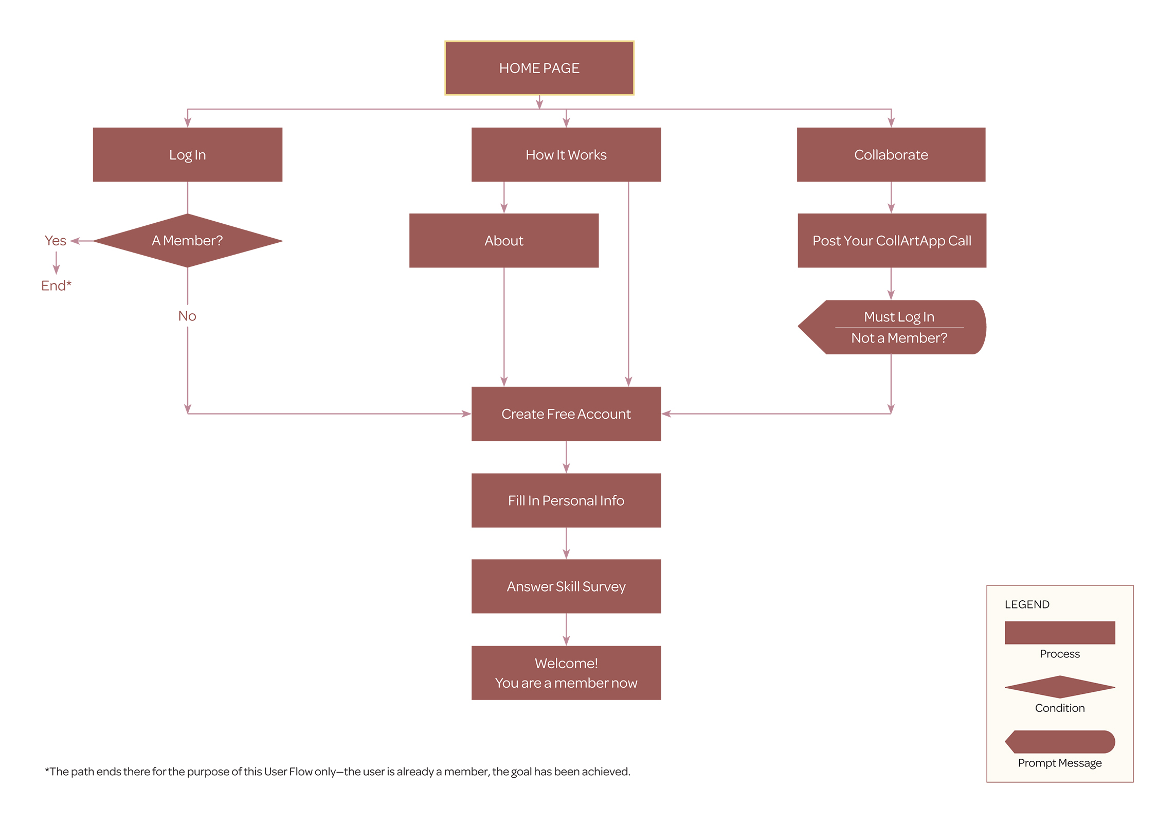
My Thought Process:
Since most of us use apps on a daily basis, we know that one can find a button to create an account under Log in—there is always a direct link included since every app tries to make the user interface as easy and as efficient as possible. If you’re a member, you just continue with your password, if not—you’re redirected to a page where you create your account and become a member. I think it’s a good idea to stick with it.
Let’s pretend that we don’t know anything about apps—so, what do we do, where do we begin? My guess would be we start by clicking on How It Works. But before selecting Create Free Account we might get curious and want to check the About section first—who knows, this might not be what we need after all. Of course, once we learn more about the app, we realize that this is the Holy Grail and can’t wait to join the app.
But, just in case there is some hesitation, I’d include a link to Create Free Account there too—with a little perk “Become a member and Save on studio rentals” or “CollArtApp Members free workshop coming soon”. Perks like that could seal the deal in a large number of cases—plus, it’s free so users have nothing to lose.
There are some users who just want to get to the point and post their calls and if there is a need to become a member, they figure, the app will ask them to create an account. And that holds true when you click on Collaborate. If you didn’t log in, you’ll be prompted to either sign in with your password or Create Free Account—it’s a very common message or a pop up window that we should definitely “steal” from other apps.
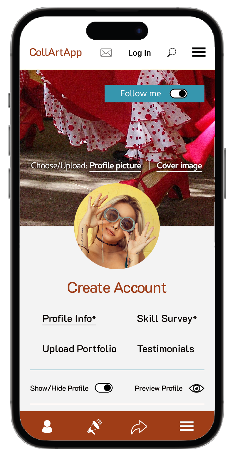
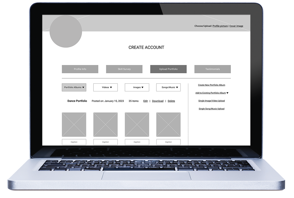
Whichever way the users enter the Create Free Account page, they’ll need to fill in their personal information, create their passwords, and answer the Skill Survey, plus agree to the CollArtApp Terms & Conditions.
The Skill Survey will play an important role—the answers will help other members (those who posted the calls or are browsing) to decide if to respond/contact or not… whether the particular user might be up to the challenge, on their artistic or technical level, or may be even too advanced for their needs.
All of those details are also very important to make sure that the members are not scammers, that all of the information they are submitting is true and that their interest in the CollArtApp and the community is genuine. Our gravest scenario would be creating an environment for scammers, unsolicited advertising or criminal activity. This app will need to be safe and well-protected against hackers.
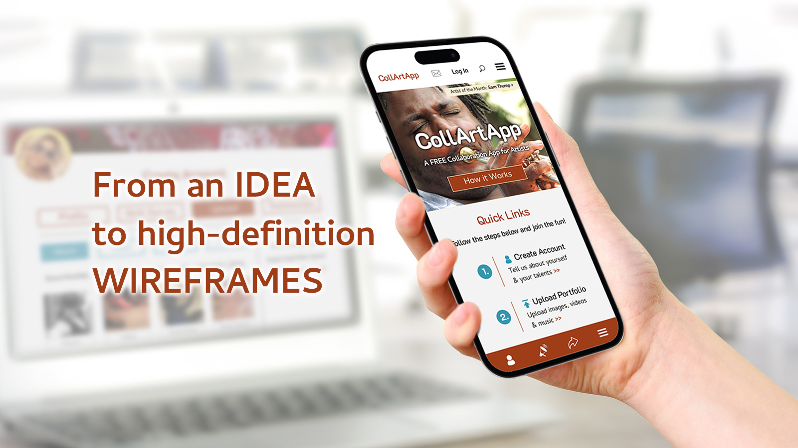
Wireframes
The “Blueprints”—low-fidelity interface screens that depict the layout (which element appears on which screen), the visual hierarchy, structure of elements and the general direction of User Interface.


Sketch »
Low-Fidelity Wireframe »
High-Definition Wireframe »
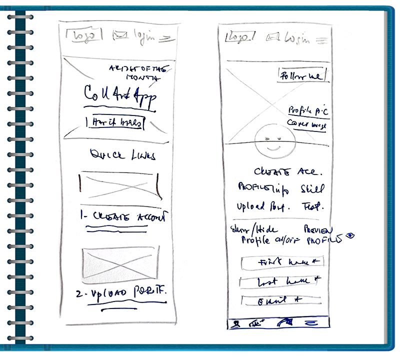
Grabbing a pencil and a piece of paper was an automatic action for me since I do it every time I need to let my creative and logical juices flow at the same time. Sketching helps me to collect my thoughts, visualize them and test them with no final commitment (yet).
Once my sketches made some sense, I moved a step higher up to Figma and created low-fidelity wireframes for both mobile and desktop platforms. I got some feedback from my friends (and teacher) along the way and incorporated their suggestions into high-definition wireframes with colour and images. (In the real world I would have continued with designing all pages/templates, getting client’s feedback, making further revisions and finally handing the prototype to developers in production).
My Thought Process & Annotations:
The purpose for these Wireframes is to highlight the prioritization of the content, App’s features and functionalities, visualization of business objectives and help creative ideas…and get feedback from clients/stakeholders, or in my case, from my teacher.
After evaluating the feedback, I created high-definition wireframes which, in the real world, would still be tested, evaluated and revised again. My goal would be to get as much feedback as possible in the first stage of the wireframes—before colour and images are applied. This way I won’t waste too much time and resources at a later date when making revisions can be more costly.
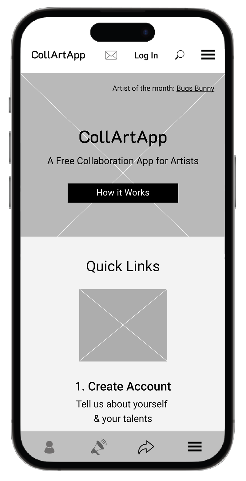
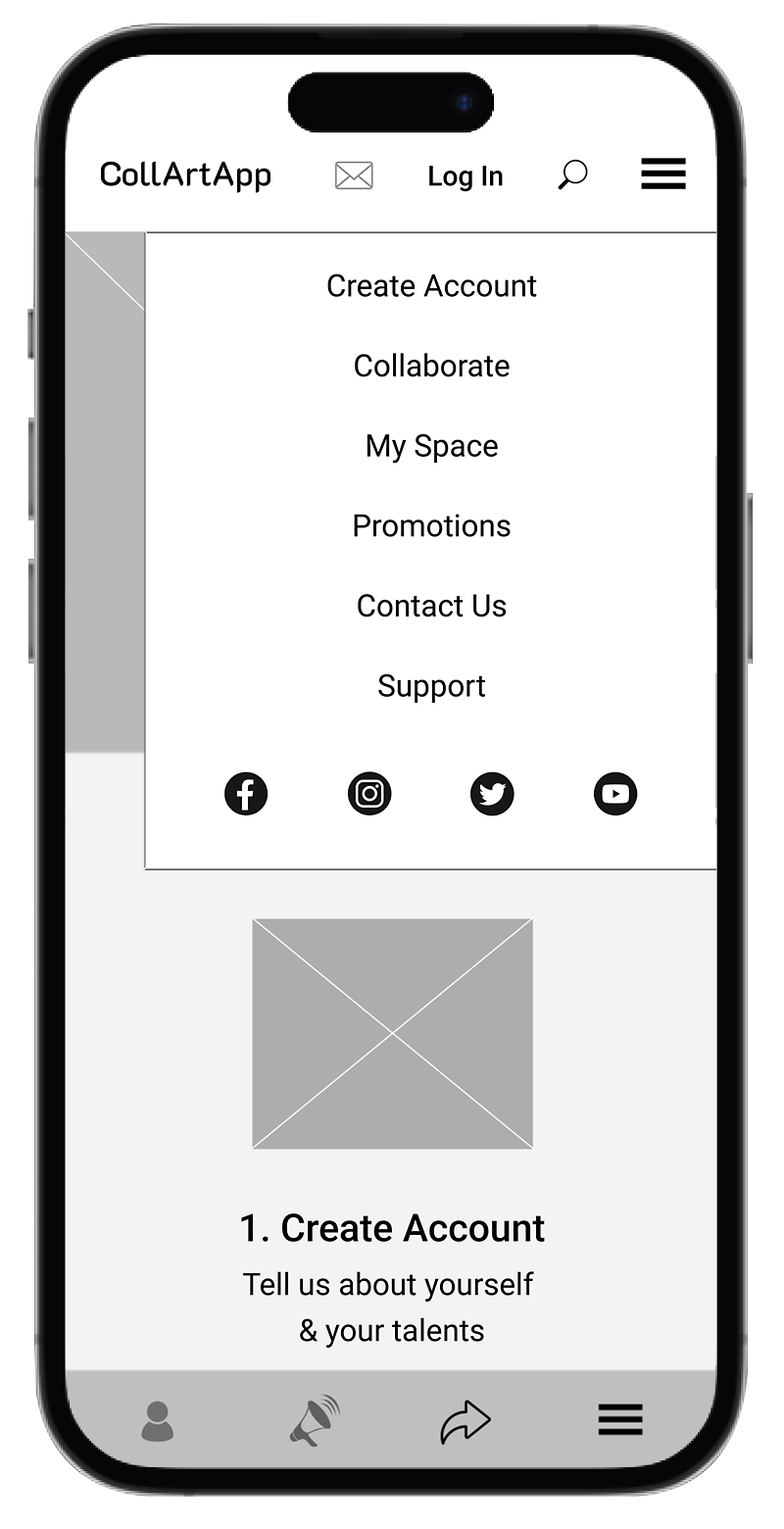
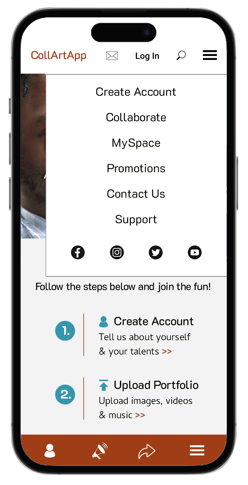
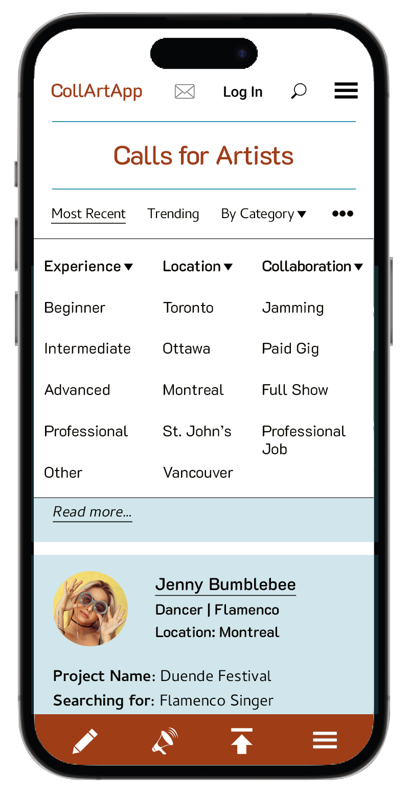
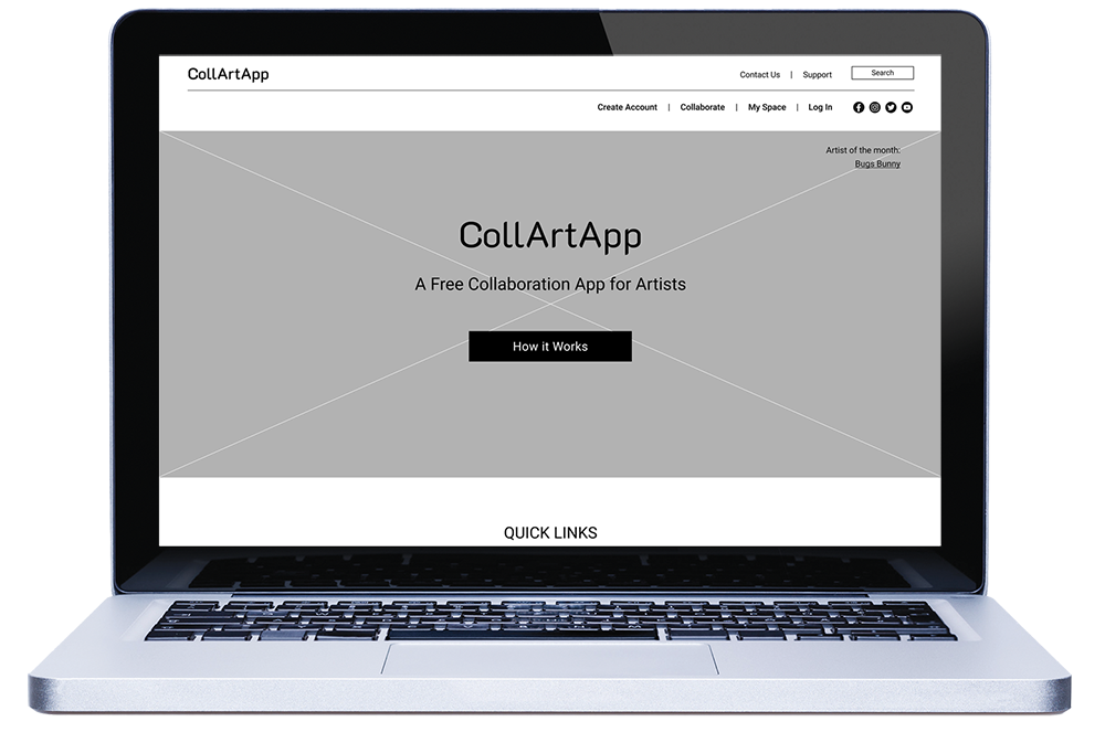
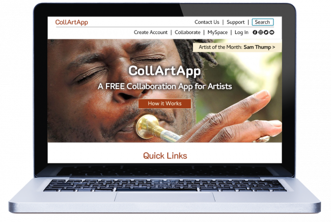
Originally I planned to include only the App logo, a hamburger menu and the search button but then I realized that the regular users will know that they need to log in first and may want to check their email right away, so I inserted those buttons as well. In this case, the mail button/envelope icon is greyed out because the user hasn’t singed in. The social media icons are also included in the hamburger menu—guessing, they are not the first thing that the users will need to see.
The Hamburger Menu will open to a larger menu that will cover most of the hero image with all the choices of the regular desktop navigation.
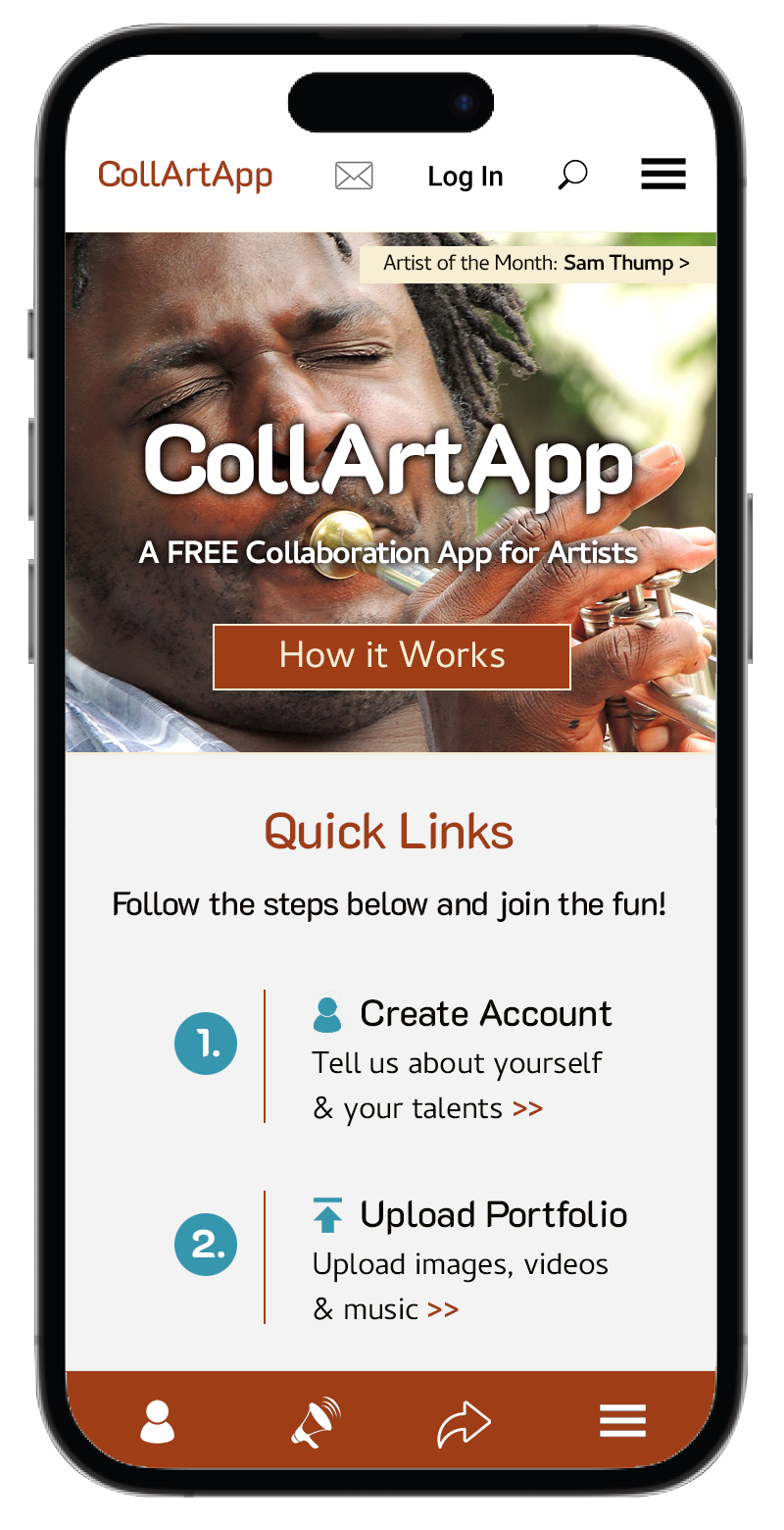
The main Hero image container will feature Artist of the Month and will be presented in either a photo gallery, a video or a combination of both. Artists will be randomly chosen from the users’ list (active profiles), and as the name says, the artist will change every month. Sam Thump—Artist’s name will be a direct link to the Profile page of the Artist.
How it Works button will open to a new page that will explain in detail and step-by-step how this app works—very similar to the section further below under Quick Links but with helpful hints, examples and ideas.
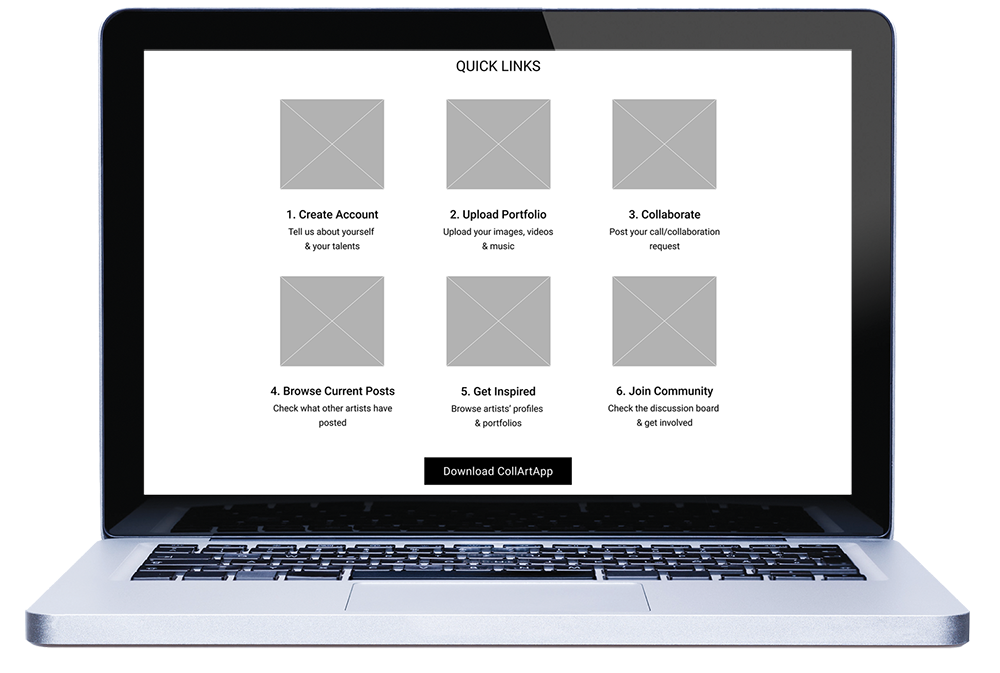
Quick Links section will serve as an informative group of shortcuts to the most important pages of the app—a reduced version of the How it Works page. Each shortcut will have a small icon to help users recognize the section. Both the icon and the heading will be active links to the specific pages.
Download CollArtApp button will take users to a new page with options to download the app for both Mac and PC platforms and most common operating systems. Users don’t have to download the app but may choose so if they prefer or need to work off-line.
Quick Preview: sample screen previews will help to ease users’ minds—to show how easy the app is, what kind of questions to expect and what kind of information, and media they need to prepare to make the app work well.
Site Map button will open to a new page listing all pages on the app and showing the relationships between them (hierarchy).
Recently I learned (to my own surprise) that there are quite many people who use the Footer Navigation to find specific pages and links (I hardly ever). From my quick research I found out that many of these users are nerdy or somewhat older and believe that footers are some kind of vessels (like Noah’s Arc) that carry all possible links to pages that are otherwise hidden at the bottom of the sea…hmmm, they do have a point there.
For all those nerds and elderly, I included links from the Global Navigation and their sub-categories, plus some hidden gems. Specifically, I’d like to mention Business Opportunities—the App will offer advertising, cross-sell, sponsorship, charity events, art classes…many opportunities to support local businesses, and build our art community.
If users have other business ideas and suggestions, they are also welcome to reach out and contact us. The rest of wireframes will have sticky footers that won’t include all links, only a hamburger menu (with the footer items) and some helpful action icons.
Desktop Wireframes
We expect most users utilizing our mobile App but to avoid missing or inconveniencing anyone, we’ll create a desktop version too. From our survey we’ve learned that the older generation of artists still uses desktop computers and since the first/launch year is always crucial, we’ll invest in the desktop platform of this App too.

Branding & Visual Identity
Creating a new brand must be based on a strong and consistent visual identity. It needs to be striking to stand out, yet, traditional to project an image of a well-established and trustworthy company.
I searched through many fonts and colours—checked their roots, and based my choices on their meanings and significance.
Logo Variations
(Collaboration Art App)
Burnt Sienna #9f3d17
Black #000000
Reversed on #9f3d17
Reversed on #000000
Font: K2D Medium
K2D is a Thai and Latin font-family with a striking modern appearance and yet, a traditional flare, which is why it caught my attention. The tiny white slits on the glyphs are its defining features and symbolize the crafty approach of the font’s creators—which represents well what CollArtApp is all about: unique, slick, artistic, and designed with attention to detail. I think it’s perfect for headings and subheadings.
Brand Typefaces
Headings, Subheadings, Body Copy
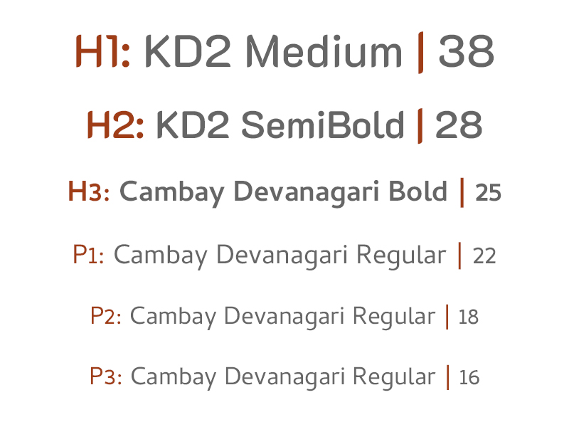
Cambay typeface hails all the way from India. It was created to cover many Indian languages but thanks to its unique characteristics and special design it’s become a world typeface supporting most languages. Knowing this I couldn’t help but explore this extraordinary font family further—our CollArtApp’s journey will be the same (I hope). We’ll start with a few Canadian cities and eventually win over the rest of the world—thanks to its unique features and user-friendly interface. Cambay and CollArtApp have lots in common!
Brand Colours
Burnt Sienna #9f3d17
Primary
Teal Blue #3696ae
Secondary
Teal Blue #6eb2c3
Background
Teal Blue #c2dfe7
Background 2: posts
Teal Blue #cde3e9
Background 3: sections
Teal Blue #e2edf0
Background 4: selections
Greyscale Palette
#666666
#727272
#a7a7a7
#cacaca
Why these colours?
Artists are known for being very emotional and passionate, constantly searching for new ways to express their ideas and bring more “umph” into our lives. I wondered what colour would demonstrate all those qualities and found Burnt Sienna. Both passionate and emotional, burnt sienna is a colour of strong feelings. From romantic to platonic affairs, burnt sienna promotes deep passion, love and adoration.
However, with all that fire on the roof, one needs to find some balance with calm and peace. And to achieve that state of mind, I chose a cooler colour: Blue Teal. Teal combines the calming properties of blue with the renewal qualities of green. It is a revitalizing and rejuvenating colour that also represents open communication and clarity of thought (also a symbol of the sea and sky). In addition, it’s a perfect colour for stress relief and thus perfect for our App.
Elements
Content Icons
Menu Icons
Social Icons
Footer Icons
Buttons

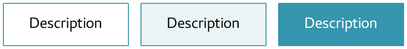
(State) Up
(State) Hover
(State) Down
Imagery
Leveraging members’ imagery, videos and music (with their permission) as much as possible to help them promote their talents on the App and thus avoiding purchasing stock media (cutting on our expenses). It will lead to a “win-win” scenario.
Conclusion
• Working on this project was an eye-opening experience. Having worked as graphic designer I thought I had a strong base to build on, which was true; however, creating a system for an interactive product with a focus on user experience was a step & jump above.
• Throughout the project I learned (or relearned) the importance of asking for feedback—from the first sketches to the high-definition wireframes and final design. It’s alway easier to redo the wireframes than make revisions when the final design has been done.
• Also, I had to remind myself not to think of design while sketching or creating wireframes—it gave me more freedom to focus on what will work better and what will be more useful for users than how pretty I could make it look.
• The best part about this project was that even when I had rough moments of hitting a wall and doubting my abilities throughout the process, I was still enjoying it and feeling a tremendous amount of satisfaction from every even minuscule achievement along the way. I’ve definitely found my new path…
‹ Click on the mobile phone to navigate to other pages or scroll down to see more.